HOW WE CAN MEASURE PROSPERITY
Introduction
Because almost every aspect of our lives is shaped by material prosperity, anyone wishing to understand issues such as government, business, finance and the environment needs to make a choice between two conflicting interpretations.
One of these is that the economy is a purely financial system which, if it were true, would mean that our economic fate is in our own hands – our ability to control the human artefact of money would enable us to achieve growth in perpetuity.
The other is that, on the contrary, money simply codifies prosperity, which itself is determined by the use of energy. This interpretation ties our circumstances and prospects to the cost and availability of energy, and explains growth in prosperity since the late 1700s as a function of the availability of cheap and abundant energy from coal, oil and gas.
The critical factor in the energy equation is the relationship between the supply of energy and the cost (expressed in energy terms) of putting energy to use. The cost element is known here as ECoE (the Energy Cost of Energy), which has been rising relentlessly over an extended period.
This means that ECoE is the ‘missing component’ in conventional economic interpretation. Whilst ECoE remained low, its omission mattered much less than it does now. This is why conventional, money-based economic modelling appeared to work pretty well, until ECoE became big enough to introduce progressive invalidation into economic models. This process can be traced to the 1990s, when conventional interpretation noticed – but could not explain – a phenomenon then labelled “secular stagnation”.
If economics should indeed be understood in energy terms, the possibility exists that we can model the economy on this basis, expressing in financial ‘language’ findings derived from energy-based interpretation. From the outset, this has been the aim of the SEEDS economic model. The alternatives to this approach are (a) to persist with money-based models which we know are becoming progressively less effective, or (b) to give up on modelling altogether, and ‘to blindly go’ into a future that we cannot understand.
SEEDS has now reached the point at which we can ‘map’ the economy on a comprehensive basis, starting with a top-level calibration of prosperity which shows that rising ECoEs are impairing the material value of energy, and will in due course reduce energy availability as well.
Starting from this top-level calibration, SEEDS goes on to map out the ways in which, as we get poorer, our scope for discretionary (non-essential) consumption will decrease, whilst economic systems will become less complex through processes including simplification (of products and processes) and de-layering.
As involuntary “de-growth” sets in, a financial system based on the false premise of ‘perpetual growth’ will fail, resulting in falls in asset values and a worsening inability to meet prior financial commitments. If we persist in using monetary manipulation in an effort to defy economic gravity, the result will be a degradation in the quality and viability of current monetary systems.
As personal prosperity shrinks, public priorities will switch towards a greater emphasis on matters of economic well-being, including the choices that we make about the use of prosperity, and its distribution as wealth and incomes.
The aim here is to explain the mapping process and set out its findings. This article starts the process by looking at how prosperity is calibrated, and the trends to be anticipated in aggregate and per-person prosperity.
A second article will evaluate what this will mean in various areas, including finance, business and government. It might then be desirable to examine how we might best adapt our systems to accommodate changes in an economy that is turning out not be a money-driven ‘perpetual growth machine’ after all.
PART ONE: CALIBRATING PROSPERITY
Energy supply
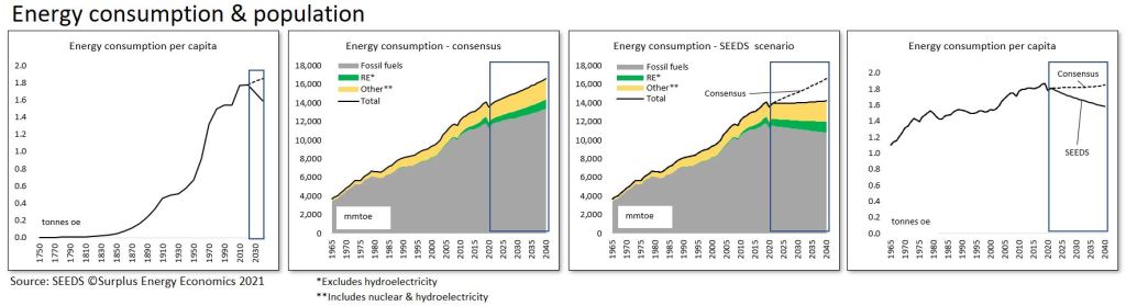
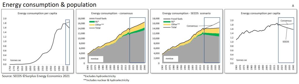
It’s an observable reality that the dramatic expansion in population numbers and economic activity since the start of the Industrial Age in the late 1700s has been a product of access to cheap and abundant energy from coal, oil and natural gas.
This has been reflected in a correspondingly rapid rise in energy use per capita. This metric has expanded along an exponential progression that has been checked only twice – once during the Great Depression of the 1930s, and again during the oil crises of the 1970s. Even these interruptions to this progression turned out to be temporary, though both were associated with severe economic hardship and financial dislocation.
Importantly, neither of these events was a function of changes in energy fundamentals. Rather, both were consequences of mismanagement within a physical (energy) context which remained favourable for growth. Preceding financial excess was at the root of the Great Depression, whilst the crises of the 1970s resulted from a breakdown in the relationship between producers and consumers of oil.
In recent times, belated recognition of the threat posed to the environment by the use of fossil fuels has shifted the focus towards ambitions for dramatic increases in renewable sources of energy (REs). But the assumption has remained that we will nevertheless be using more energy, not less – and, very probably, more fossil fuels – for the foreseeable future.
The consensus expectation, as of late-2019, was that, despite an assumed rapid increase in the supply of REs, the world would nevertheless be using about 14% more fossil fuels in 2040 than it used in 2018, with the consumption of oil increasing by 10-12%, and no overall fall in the use of coal.
These assumptions were reflected in the depressing conclusion that emissions of CO² would continue to grow, with massive investment in non-fossil alternatives doing nothing more than blunt the rate of emissions increase.
The flip-side of these projections was the almost unchallenged faith that continued to be placed in a ‘future of more’ – for example, it was assumed that, by 2040, there would be an increase of about 75% in the world’s vehicle fleet, and that passenger flights would have expanded by about 90%. Automation – as a use of energy – would continue, as would the consumption of non-essential (discretionary) goods and services.
Government, business and financial planning remains predicated on this assumption of never-ending economic expansion.
Fundamentally, none of these assumptions has been re-thought because of the coronavirus crisis. Expectations for the future ‘mix’ of energy supply may have changed since late-2019, but the consensus view seems to remain that, after the energy consumption hiatus caused by the covid crisis, the future will still be shaped by a continuing expansion in the use of primary energy. It still seems to be assumed that there will be no overall reduction in the use of fossil fuels, at least until the middle years of the century. Needless to say, faith in a ‘future of more’ remains unshaken.
Some commentators may opine that the fossil fuel industries are ‘finished’, but realistic assessments of the rates at which RE capacities are capable of expanding do not support a view that REs can expand rapidly enough to replace much of our current reliance on oil, gas and coal.
The problem with all of the consensus forecasts seems to be that forward energy use projections are a function of economic assumptions. Thus, if the economy is assumed to be X% bigger by, say, 2040, then its energy needs will have risen by Y%, and the deduction of non-fossil supply projections for 2040 leaves our need for fossil fuels in that year as a residual.
This, of course, is to take things in the wrong order. What we should be doing is assessing the future energy outlook, and only then asking ourselves how much economic activity the projected level (and cost) of energy supply is likely to support.
For this reason, SEEDS no longer uses consensus-based projections for future energy supply. The SEEDS alternative scenario sees the world having 8% less fossil fuel energy available in 2040 than was used in 2018. The inclusion of assumed rapid increases in contributions from non-fossil sources still leaves total primary energy supply no higher in 2040 than it was in 2018. Even this scenario might turn out to have been over-optimistic.
This in turn means that primary energy use per person has now started to decline. Something along these lines happened during the 1930s and the 1970s, but neither was more than a temporary hiatus in a continuing upwards trend.
Fig. A
ECoE and surplus energy
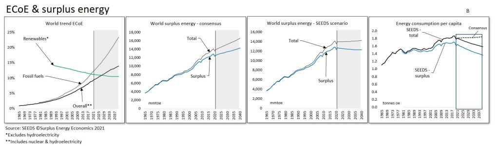
For the purposes of economic modelling, the aggregate amount of energy available at any given time needs to be calibrated to incorporate changes in the energy cost of accessing that energy. The principle involved is that, whenever energy is accessed for our use, some of that energy is always consumed in the access process, meaning that it is not available for any other economic purpose. This ‘consumed in access’ component is known here as ECoE (the Energy Cost of Energy).
The processes which drive changes in the level of ECoE are reasonably well understood. In the early stages of the use of any type of energy, ECoEs are driven downwards by a combination of geographic reach and economies of scale. Once these drivers are exhausted, depletion kicks in, driving ECoEs back upwards.
Technology acts to reinforce the downwards pressures exerted by reach and scale, and mitigates the upwards cost pressure of depletion. But the scope of technology is limited by the physical characteristics of the energy resource, such that no amount of technological progress can, for instance, cancel out the effects of depletion.
Thanks to scale and reach, assisted by progress in technology, the ECoEs of fossil fuels fell steadily for most of the Industrial Age until they reached a nadir that occurred during the twenty years after 1945. This meant that, until this nadir arrived, we benefited both from increasing total energy supplies and from falling ECoEs. This is to say that ‘surplus’ (ex-ECoE) energy availability increased more rapidly than the totality of supply.
For a long time now, though, the ECoEs of oil, gas and coal have been rising, a function of depletion, only partially mitigated by technology. With fossil fuels still accounting for more than four-fifths of all primary energy consumption, this has meant that overall ECoE, too, has risen relentlessly. This overall trend, as calibrated by SEEDS, is that ECoE rose from 1.8% in 1980 to 4.2% in 2000 and 6.4% in 2010, with the number for 2020 put at 9.0% and an ECoE of 11.6% projected for 2030.
This interpretation, taken together with volume projections – themselves heavily influenced by ECoE cost trends – suggest that the decline in total energy use per person will be compounded by a still-faster fall in surplus energy supply per person. This, incidentally, means that surplus energy, both in aggregate and per capita, would fall even if the over-optimistic consensus view on aggregate energy supply turned out to be correct.
The great hope, of course, has to be that the downwards trend in the ECoEs of REs will continue indefinitely, eventually driving overall ECoEs back downwards. This is unlikely to happen, not least because expansion in RE capacity continues to depend on inputs made available by the use of resources whose availability relies on the use of fossil fuels. We cannot – yet, anyway – build wind turbines or solar panels using only the energy that wind and solar power generation can provide.
Though the ECoEs of REs are indeed at or near the point of crossover with those of fossil fuels, this is really a function of the continuing, relentless rise in the costs of accessing oil, gas and coal.
It is, of course, a truism that equal calorific quantities of energy from different sources have different characteristics. Energy from petroleum, for instance, is ideally suited for use in cars and commercial vehicles, whereas wind and solar energy are better suited to transport systems like trains and trams. Public transport systems, powered directly, can greatly reduce our reliance on the insertion of batteries into the sequence between the supply and use of electricity.
This, essentially, is a management issue, in which trying to drive petroleum-optimised vehicles with wind or solar electricity can be likened to trying to propel a sailing ship using steam directed at its sails.
Fig. B

Economic output
With the role of prosperity-determining surplus energy understood, the next stage in energy-based mapping of the economy is to connect this to the financial calibrations through which, by convention, economic debate is presented.
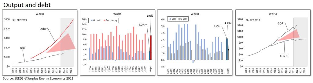
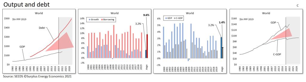
Unfortunately, the conventionally favoured metric of GDP is unsuited to this purpose, essentially because rapid expansion in debt (and in other liabilities) creates a sympathetic (and artificial) increase in apparent GDP.
Regular readers will be familiar with the ‘wedge’ interpretation set out in the next set of charts. Between 1999 and 2019, reported GDP increased by $66tn (PPP*) whilst debt expanded by $197tn, meaning that each dollar of reported “growth” was accompanied by $3 of net new debt. Over a period in which GDP grew at an average rate of 3.2%, annual borrowing averaged 9.6% of GDP.
With these credit distortions understood and excluded, the rate of growth falls from the reported 3.2% to just 1.4% on an underlying basis. The calibration of underlying or ‘clean’ output (C-GDP) reveals that the insertion of a ‘wedge’ between debt and C-GDP is reflected in the emergence of a corresponding wedge between reported (GDP) and underlying (C-GDP) economic output.
This in turn means that we are deluding ourselves, not just about the real level of economic output but also about the various ratios and distributions based upon that metric.
Fig. C
Prosperity
Ultimately, the basis of any effective system for interpreting and modelling the economy must be the identification of prosperity, a concept which can then be used as the denominator in a host of important equations. The SEEDS model accomplishes this by identifying C-GDP and then deducting trend ECoE.
C-GDP defines economic output, but recognition of the role of ECoE means that this output is not, in its entirety, ’free and clear’. Output, measured as C-GDP, is the financial counterpart of the aggregate energy available for use. But a proportion of this energy value – and, consequently, a corresponding proportion of economic output – is required for the supply of energy itself, and is not, therefore, available for any other economic purpose. Accordingly, trend ECoE is deducted from C-GDP output to arrive at a calibration of prosperity. This, of course, can be expressed either in aggregate or in per capita amounts.
Before going further, we can note that an equation involving four components defines material well-being calibrated as prosperity. First, we need to know the quantity (Q) of energy available for economic use. Second, we need to identify the conversion efficiency (CE) with which this energy is turned into economic value (O).
Third, we need to deduct ECoE to know how much of this economic value is ‘free and clear’ for use in all economic purposes other than the supply of energy itself. Fourth, the division of the resulting aggregate prosperity (P) by the population number (N) tells us the prosperity of the average person in the economy.
At the top level, this equation reveals the onset of a deterioration in global prosperity per person. Energy quantity growth (Q) is slowing, and the best we can expect for conversion efficiency (CE) is somewhere between static and gradually eroding. ECoEs are continuing to rise, and the number of people between whom prosperity (P) is shared continues to increase.
A summary of projected trends in prosperity per person is set out in the following table.
Table 1
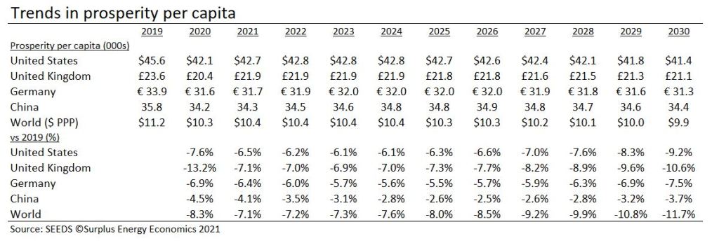
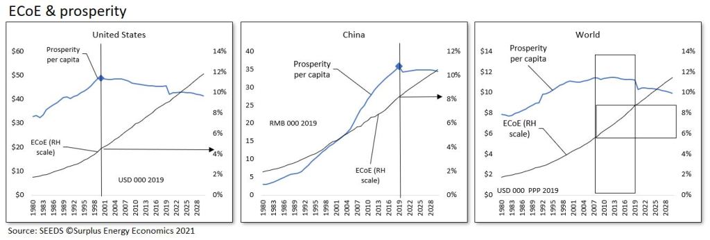
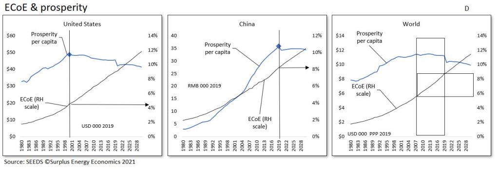
A critical determinant which emerges from this equation is the existence of a direct correlation between ECoE and prosperity per capita. In the United States, prosperity per person turned down after 2000, when American trend ECoE was 4.5%. The coronavirus crisis seems to have brought forwards the inflection-point in China to 2019, when the country’s trend ECoE was 8.2%.
Broad observation across the thirty countries covered by SEEDS indicates that complexity determines the level of ECoE at which prosperity per capita turns downwards. In the sixteen advanced economies group analysed by the model (AE-16), the inflection point occurs at ECoEs of between 3.5% and 5%. The equivalent range for the fourteen EM (emerging market) countries (EM-14) runs from 8% to 10%.
This has meant that EM countries’ prosperity has continued to improve as that of the AE-16 group has turned down. This in turn has meant that global, all-countries prosperity has been on a long plateau, with continued progress in some countries offsetting deterioration in others.
Now, though, the model indicates that the plateau has ended, meaning that, from here on, the world’s average person gets poorer.
Fig. D
These top-down findings are a good point at which to conclude the first part of this explanation of the energy-based mapping of the economy of which SEEDS is now capable. In Part Two, we shall follow some of its implications, looking at assets and liabilities, the outlook for businesses and the challenges facing government.
The map unrolled. Feb. 24, 2021.
THE CONCLUSIONS OF THE SEEDS MAPPING PROJECT
Foreword
What follows is one of the longest articles ever to appear here, and certainly one of the most ambitious. The aim is to take readers all the way through the Surplus Energy Economics interpretation of the economy, from principles and background, via energy supply and cost, to environmental implications, economic output and prosperity, and the circumstances and prospects of individuals, the financial system, business and government.
Because what follows includes some commentary on business, readers are reminded that this site does not provide investment advice, and must not be used for this purpose. It is, as ever, to be hoped that issues of politics and government can be discussed in a non-partisan way, and that the principle of “play the ball, not the man” can be respected.
The reason for presenting this synopsis at this time is that the second phase of the SEEDS programme – the mapping of the economy from an energy-based perspective – is now all but complete. Three components of this programme remain at the development phase, but provide sufficient indicative information for use here. One of these is the calculation of “essential” calls on household resources; the second is conversion from average per capita to median prosperity; and the third is the SEEDS-specific concept of the excess claims embodied in the financial economy.
SEEDS began as an investigation into whether it was possible to model the economy on the right principles (those of energy) rather than the wrong ones (that the economy is simply a financial system). It was always going to be essential that results should for the most part be expressed in monetary language, even though the model itself operates on energy principles.
With prosperity calibrated, it then made sense to extend the model into comprehensive economic mapping. Aside from the three components still in need of further refinement, this mapping project is now complete.
For the most part, mapping as presented here is global in extent, though some national and regional data is used. If SEEDS is to continue, a logical next step would be to extend the mapping process to individual economies.
Lastly, by way of preface, this article is the most comprehensive guide to SEEDS and the Surplus Energy Economy yet published here, and it would be marvellous if readers were to see fit to pass it on to others as a way of ‘spreading the word’ about how the economy really works.
Introduction
Long before the coronavirus crisis, we had been living in a world suffering from a progressive loss of the ability to understand its own economic predicament. This lack of comprehension results directly from unthinking acceptance of the fundamentally mistaken orthodoxy that the economy is ‘simply a matter of money’.
If this were true – and given that money is a human artefact, wholly under our control – then there need be no obstacle to economic growth ‘in perpetuity’. This never-ending ‘future of more’ is nothing more than an unfounded assumption, yet it is treated as an article of faith by decision-makers in government, business and finance.
‘Growth in perpetuity’ is a concept which, though seldom challenged, is really an extrapolation from false principles. At the same time, those mechanisms which orthodox economics is pleased to call ‘laws’ are, in reality, nothing more than behavioural observations about the human artefact of money. They are not remotely equivalent to the real laws of science.
The fact of the matter, of course, is that the belief that economics is simply ‘the study of money’ is a fallacy, and defies both logic and observation. At its most fundamental, wholly financial interpretation of the economy is illogical, because it tries to explain a material economy in terms of the immaterial concept of money.
Logic informs us that all of the goods and services that constitute economic output are products of the use of energy. Other natural resources are important, to be sure, but the supply of foodstuffs, water, minerals and so on is wholly a function of the availability of energy. Energy is critical, too, as the link which connects economic activity with environmental and ecological degradation. Without access to energy, the environment would not be subject to human-initiated risk – and the economy itself would not exist.
Observation reveals an indisputable connection between the rapid material (and population) expansion of the Industrial Age and the use of ever-increasing amounts of fossil fuel energy since the first efficient heat-engines were developed in the late 1700s.
Two further observations are important here. The first is that, whenever energy is accessed for our use, some of that energy is always consumed in the access process. We cannot drill a well, build a refinery or a pipeline, construct wind turbines or solar panels, or create and maintain an electricity grid, without using energy. This ‘consumed in access’ component is known in Surplus Energy Economics as the Energy Cost of Energy, or ECoE.
The second critical observation is that money has no intrinsic worth, but commands value only as a ‘claim’ on the goods and services made available by the use of energy. Money can only fulfil its function as a ‘medium of exchange’ if there is something of economic utility for which an exchange can be made. Just as money is a ‘claim on energy’, so debt – as a claim on future money – is in reality a ‘claim on future energy’.
False premises, mistaken decisions
Critical trends in recent economic history can only be understood on the basis of energy, ECoE and exchange. ECoEs, which had fallen throughout much of the Industrial Age, turned upwards in the years after 1945 but, until the 1990s, remained low enough for their omission not to impose a visibly distorting effect on orthodox economic interpretation.
The point at which ECoEs became big enough to start invalidating conventional models was reached during the 1990s. The resulting phenomenon of economic deceleration was noted, and indeed labelled (“secular stagnation”), but it was not traced to its cause.
An orthodoxy resolutely bound to the fallacy of wholly financial interpretation naturally sought monetary explanations and monetary ‘fixes’. The idea that financial tools can overcome physical constraints can be likened to attempting to cure an ailing house-plant with a spanner. Its pursuit pushed us into ‘credit adventurism’ in the years preceding the 2008 global financial crisis, and then into the compounding and hazardous futility of ‘monetary adventurism’ during and after the GFC.
This has left us relying on false maps of a terrain that we do not understand. Almost all of our prior certainties have disappeared. We turned away from market principles by choosing financial legerdemain over market outcomes during 2008-09 and, at the same time, we abandoned the ‘capitalist’ system by destroying real returns on capital. The aim here is to present an alternative basis of interpretation that accords both with logic and with observation.
Beyond vacuous phrases which echo earlier certainties, governments no longer have ‘economic policies’ as such. Even the pretence of economic strategy was ditched when governments abdicated from the economic arena, and handed over the conduct of macroeconomics to central bankers. Asset markets have become wholly dysfunctional – they no longer price risk, and have been stripped of their price discovery function. The relationship between asset prices and all forms of income (wages, profits, dividends, interest and rents) has been distorted far beyond the bounds of sustainability.
Unless real incomes can rise – which is in the highest degree unlikely – asset prices must correct sharply back into an equilibrium with incomes that was jettisoned through the gimmickry of 2008-09. Efforts to prevent asset price slumps can only add to the strains already inflicted upon fiat currencies.
Ultimately, our manipulation of money has had the effect of tying the viability of monetary systems to our ability to go on ignoring and denying the realities of an economy being undermined by a deteriorating energy dynamic.
The energy driver
Our analysis necessarily starts with energy, a topic covered in more detail in the previous article. The informed consensus position, immediately prior to the coronavirus crisis, was that total energy supply would continue to expand, increasing by about 19% between 2018 and 2040.
Within this overall trajectory, renewable energy sources (REs) would grow their share of primary energy use, and the combined contributions of hydroelectric and nuclear power, too, would expand.
Even so, it was projected that quantities of fossil fuels consumed would rise, with about 10-12% more oil, 30-32% more natural gas, and roughly the same amount of coal being used in 2040 as in 2018.
These consensus views were (and in all probability still are) starkly at variance with a popular narrative which sees us replacing most, perhaps almost all, use of fossil fuels by 2050. The rates of RE capacity expansion that the popular narrative implies would require vast financial investment and, more to the point, would call for a correspondingly enormous amount of material inputs whose availability is, for the foreseeable future, dependent on the continuing use of fossil fuels.
SEEDS uses an alternative energy scenario which projects a decline in the supply of fossil fuels, a trajectory dictated by the rising ECoEs of oil, gas and coal. Essentially, the costs of supplying oil, gas and coal have already risen to levels above consumer affordability. The SEEDS scenario anticipates a pace of growth in RE supply which, whilst outpacing the 2019 consensus, necessarily falls short of a popular narrative which is as weak on practicalities as it is strong on good intentions.
The result of this forecasting is that the total supply of primary energy is unlikely to be any larger in 2040 than it was in 2018.
What this in turn means is that energy supply per person will decline. Such a downturn has only been experienced twice (to any meaningful extent) in the Industrial Age – once during the Great Depression of the 1930s, and again during the oil crises of the 1970s.
Neither of these downturns was physical in causation – they resulted from mismanagement, rather than changes in energy supply fundamentals – but both were associated with serious economic hardship and severe financial dislocation. Furthermore, what happened in the 1930s and the 1970s wasn’t really a downturn but, rather, no more than a pause in the upwards trajectory of energy use per person.
These parameters are illustrated in Fig. A. All of the charts used here can be enlarged for greater clarity, and all of them are sourced from the SEEDS mapping system. [go to the article on Morgan's SEEDs site for better versions of the graphics]
Fig. A
It will be appreciated, then, that we have entered a phase – of declining energy availability per person – which can be expected to have a profoundly adverse effect on economic well-being and financial stability.
These effects will be compounded by a relentless rise in ECoEs that is most unlikely to be stemmed by the volumetric expansion of REs. As we shall see, prosperity per person turned down at ECoEs of between 3.5% and 5.0% in the advanced economies of the West, and at rather higher (8-10%) thresholds in EM (emerging market) countries. But we cannot realistically expect that the ECoEs of wind and solar power will fall much below 10%. This means that they cannot replicate the economic value delivered by fossil fuels in their heyday.
Accordingly, surplus energy per person – that is, the aggregate amount of energy less the ECoE deduction – is set to decline, and would do so even if the over-optimistic consensus projection for aggregate energy supply could be realised.
Anticipated trends in ECoEs and the availability of surplus energy are summarised in Fig. B.
Fig. B
Cleaner, but poorer
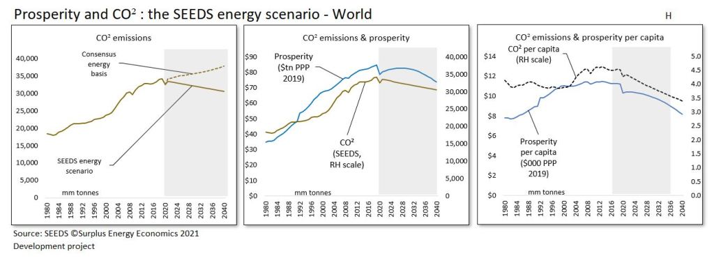
This does at least mean that annual emissions of climate-harming CO² can be expected to decrease. Unfortunately, this welcome trend will be a function, not of a seamless transition to an RE-based economy, but of deteriorating prosperity.
On the SEEDS energy scenario, annual emissions of CO² are likely to fall by 10% between 2019 and 2040, rather than rising by about 11% over that period. This, however, will correspond to a projected decline of 27% in global average prosperity per capita.
Some of the environmental projections that emerge from SEEDS mapping are set out in Fig. H. It need hardly be said that the relationship between the economy and the environment cannot meaningfully be interpreted until energy, rather than money, is placed at the centre of the equation.
Promises of a cleaner future are realisable, then, but assurances of a cleaner future combined with sustained (let alone growing) material prosperity are not.
Fig. H
Economic output
When we note that each dollar of reported economic expansion between 1999 and 2019 was accompanied by the creation of $3 of net new debt – and that GDP “growth” of 3.2% was supported by annual borrowing averaging 9.6% of GDP – we are in a position to appreciate that most (indeed, almost two-thirds) of all reported increases in GDP over the past two decades have been the cosmetic effect of credit and monetary expansion. If credit expansion were ever to cease, rates of growth in GDP would fall to barely 1.0% – and, if we ever tried to roll back prior credit expansion, GDP would fall very sharply.
Stripping out the credit effect enables us to identify a “clean” rate of growth in economic output that turns out to have averaged 1.4% (rather than the reported 3.2%) during the twenty years preceding 2019. As can be seen in Fig. C, the driving of a “wedge” between debt and GDP has inserted a corresponding wedge between GDP itself and its underlying or “clean” (C-GDP) equivalent.
Fig. C
Prosperity
With underlying economic output established, prosperity – both aggregate and per capita – can be identified through the application of trend ECoE. This reflects the fact that ECoE is the component of energy supply which, being consumed in the process of accessing energy, is not available for any other economic purpose. In terms of their relationships with energy, C-GDP corresponds to total energy supply, whilst prosperity corresponds to surplus (ex-ECoE) energy availability. SEEDS identifies the ratio at which energy use converts into economic value, and applies ECoE to establish the relationship between energy consumption and material prosperity.
As well as providing our central economic benchmark, the calibration of prosperity enables us to establish the relationship between material well-being and trends in ECoE. In Western advanced economies, SEEDS analysis shows that prosperity per capita turned down at ECoEs of between 3.5% and 5.0%. In the less complex, less ECoE-sensitive EM countries, the corresponding threshold lies between ECoEs of 8% and 10%.
These relationships, identified by SEEDS, are wholly consistent with what we would expect from a situation in which energy costs are linked directly to the maintenance costs of complex systems.
Illustratively, prosperity per capita in the United States turned down back in 2000, at an ECoE of 4.5% (Fig. D). Chinese prosperity growth appears to have gone into reverse in 2019, at an ECoE of 8.2%, though, had it not been for the coronavirus crisis, the inflection point for China might not have occurred until the point – within the next two or so years – at which the country’s trend ECoE rises to between 8.7% (2021) and 9.1% (2023).
Globally, average prosperity per person has been flat-lining since the early 2000s, but has now turned down in a way that means that the “long plateau” in world material prosperity has ended.
This conclusion is wholly unidentifiable on the conventional, money-only basis of economic interpretation.
Fig. D
Financial
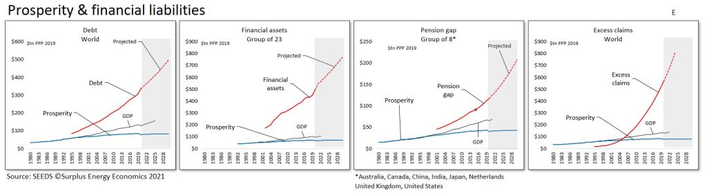
The identification of aggregate prosperity enables us to recalibrate measurement of financial exposure away from the customary (but wholly misleading) denominator of GDP. Four such calibrations are summarised in Fig. E.
Conventional measurement states that world debt rose from 160% to 230% of GDP between 1999 and 2019 – essentially, a real-terms debt increase of 177% was moderated by a near-doubling (+95%) of recorded GDP, leaving the ratio itself higher by only 42% (230/160).
This, though, is a misleading measurement, because it overlooks the fact that GDP was itself pushed up by the breakneck pace of borrowing.
Rebased to aggregate prosperity – which was only 28% higher in 2019 than it had been in 1999 – the ratio of debt-to-output climbed from 168% to 363% over that same period. Preliminary estimates for 2020 suggest that an increase of around 10% in world debt has combined with a 7.4% fall in prosperity to push the ratio up to 430%.
The second measure of financial exposure generated by SEEDS relates prosperity to the totality of financial assets. SEEDS uses data from 23 of the countries for which financial assets information is available, countries which together equate to just over 75% of the world economy.
On this basis, systemic exposure has exploded, from 326% of prosperity in 2002 (when the data series begin) to 620% at the end of 2019. Extraordinarily loose fiscal and monetary policy during 2020 suggests that this ratio may already exceed 730% of prosperity.
Gaps in pension provision are a further useful indicator of financial unsustainability. Back in 2016, the World Economic Forum calculated pension gaps for a group of eight countries – Australia, Canada, China, India, Japan, the Netherlands, Britain and America – at $67tn, and projected an increase to more $420tn by 2050.
Converting these numbers from 2015 to 2019 values, and then expressing their local equivalents in dollars on the PPP (purchasing power parity) rather than the market basis of exchange rates, puts the number for the end of 2020 at $112 trillion, which equates to 290% of the eight countries’ aggregate prosperity (and 180% of their combined GDPs). Pension gaps are growing at annual rates of close to 6%, a pace that not even credit-fuelled GDP – let alone underlying prosperity – can be expected to match.
The fourth measure of financial exposure produced by SEEDS is specific to the model. As we have seen, monetary systems embody ‘claims’ on a real (energy) economy that has grown far less rapidly than its financial counterpart. This has resulted in the accumulation of very large excess claims.
Calibration of this all-embracing measure, which is known in the model as E4, remains at the development stage. Indicatively, though, it informs us that the world has been piling on financial claims that cannot possibly be met ‘at value’ from the economic prosperity of the future.
From this it can be inferred that a process of systemic ‘claims destruction’ has become inevitable, suggesting that the process known conventionally as ‘value destruction’ cannot now be prevented from happening at a systemically hazardous scale. The most probable process by which this will happen is the degradation of the value of money, meaning that claims can only be met with monetary quantities whose purchasing power is drastically lower than it was at the time that the claims were created.
Measurement of excess claims forms part of a SEEDS national risk matrix which combines purely financial exposure with a number of other factors, one of which is ‘acquiescence risk’. This calculation references growing popular dissatisfaction induced by deteriorating overall and discretionary prosperity.
Fig. E
The individual
The ultimate purpose of economics is, or should be, the measurement, interpretation and (where possible) the betterment of the prosperity of the individual. Situations and projections can be expressed either as an average per capita number, or in amounts weighted to the median on the basis of the distribution of incomes. Average calibration is the primary focus of the model, but a new SEEDS capability (‘FW’) – being developed in response to reader interest in this subject – provides some insights into distributional effects.
As we have seen, the prosperity of the average person has been on a downwards trend in almost all of the Western advanced economies since well before the 2008 GFC. In ‘top-level’ prosperity terms, however, declines thus far have appeared pretty modest, even in the worst-affected countries – in 2019, British citizens were 10.4% poorer than they had been in 2004, with Italians poorer by 10.2% since 2001, and Australians worse off by 10.0% since 2003.
But top-line prosperity, like income, isn’t ‘free and clear’ for the individual to spend as he or she sees fit. Rather, prosperity is subject to prior calls, of which “essentials” are the most significant. Only after these essential outlays have been deducted do we arrive at the average person’s discretionary prosperity, meaning the resources that he or she can use to pay for things that they “want, but do not need”.
Measurement of discretionary prosperity produces rates of decline that are much more pronounced, and are distributed differently between countries, than the equivalent top-line calibrations. British citizens have again fared worst, seeing their discretionary prosperity fall by 32% between 2000 and 2019. The average Spaniard had 26.7% less discretionary prosperity in 2019 than he or she enjoyed back in 1999, whilst the decline in the Netherlands (also since 1999) was 26.5%. This decrease in the value of the discretionary “pound (or dollar, or euro, or yen) in your pocket” correlates directly to rising indebtedness and worsening insecurity, but does so in ways that are not recognised by policy-makers tied to conventional interpretation.
Of course, discretionary consumption has, at least until quite recently, continued to increase, even though discretionary prosperity has fallen. The difference between the two equates to rising per-person shares of government, business and household debt.
Calibration of discretionary prosperity obviously requires measurement of the cost of “essentials”. As mentioned earlier, this is one of the three components of the SEEDS mapping system that are still subject to further development. The conclusions which follow should, therefore, be regarded as indicative.
For our purposes, “essentials” are defined as those things that the individual has to pay for. This means that “essentials” include two components. One of these is household necessities, and the other is government expenditure on public services. These services qualify as “essentials” on the “has to pay for” definition, whatever the individual might happen to think about the services which he or she is obliged to fund. The government component of “essentials” relates only to public services, and does not include transfers (such as pension and welfare payments), which simply move money between people and so wash out to zero at the aggregate or the per capita level of calculation.
SEEDS analyses of prosperity per capita are summarised in Fig. F. In the AE-16 group of advanced economies, taxation (and transfers), being more cyclical, have tended to fluctuate more than spending on public services.
Together, the two components of “essentials” have moved up in real terms, even as prosperity has deteriorated, exerting a tightening squeeze on discretionary prosperity. Because of the credit effects which are interposed between GDP and prosperity, this squeeze cannot – despite its profound commercial, financial and political implications – be identified by conventional interpretation. It can be corroborated, though, by analysis of per capita indebtedness and of broader financial commitments.
As the charts show, relatively modest declines in the overall prosperity of citizens in America, Britain and Japan are leveraged into much sharper falls in their discretionary prosperity.
Fig. F

The median individual
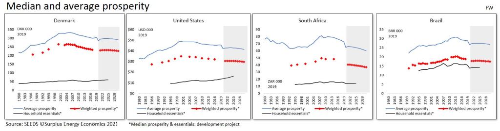
Of course, a country’s ‘average’ person is a somewhat theoretical figure, and one of the remaining SEEDS development projects addresses weighting for the difference between the average and the median person.
Because data for income distribution is intermittent, median prosperity per person is illustrated as dashed red lines in Fig. FW. These charts compare median with average prosperity per capita in four countries, and include the household (but, as yet, not the public services) component of “essentials”.
They show a comfortable margin in comparatively egalitarian Denmark (though the cost of public services in Denmark is relatively high). America remains a “rich” country – albeit less rich than she once was – in which household necessities remain affordable within the prosperity of the median person or household. But the situation in South Africa – and even more so in Brazil – must give rise to considerable concern.
Fig. FW
Business
Obviously enough, the compression being exerted on discretionary prosperity is of great importance to businesses, which are in danger of working to false premises when they rely on the promise of ‘perpetual growth’ provided by orthodox economic interpretation. Companies in discretionary sectors may not realise the extent to which their fortunes are tied to the continuity of credit and monetary expansion.
There are two critical (and related) points of context here. The first is that, as societies become less prosperous, they will also become less complex, rolling back much of the increase in complexity that has accompanied the dramatic economic growth of the Industrial Age. The second is that the proportion of prosperity subject to the prior calls of essentials will rise.
A logical outcome of de-complexification is simplification, both of product ranges and of supply processes. This will be accompanied by de-layering, whereby some functions are eliminated.
Two further factors which can be expected to change the business landscape are falling utilization rates and a loss of critical mass. The former occurs where a decline in volumes increases the per-customer (or unit) equivalent of fixed costs. Efforts to pass on these increased unit costs can be expected to accelerate the decline in customer purchases, creating a downwards spiral.
Critical mass is lost when important components or services cease to be available as suppliers are themselves impacted by simplification and utilization effects. It is important to note that falling utilization rates and a loss of critical mass can be expected to occur in conjunction with each other, combining to introduce a structural component into future declines in prosperity.
These considerations put various aspects of prevalent business models at risk, and this should be considered in the context both of worsening financial stress and of deteriorating consumer prosperity. One model worthy of note is that which prioritizes the signing up of customers over immediate sales. Previously confined largely to mortgages, rents and limited consumer credit, these calls on incomes now extend across a gamut of purchase and service commitments which can be expected to degrade as consumer prosperity erodes. This has implications both for business models based on streams of income and for situations in which forward income streams have been capitalized into traded assets.
Government
The SEEDS database reveals a striking consistency between levels of government revenue and recorded GDP. In the AE-16 group of advanced economies, government revenues seldom varied much from 36-37% of GDP over the period between 1995 and 2019. Accordingly, government revenues have expanded at real rates of about 3.2% annually. We can assume that similar assumptions inform revenue expectations for the future.
As we have seen, though, reported GDP has diverged ever further from prosperity, meaning that there has been a relentless increase in taxation when measured as a proportion of prosperity. In the AE-16 countries, this ratio has risen from 38% in 1995 to 49% in 2019, and is set to hit 55% of prosperity by 2025 based on current trends (see Fig. G4A).
It is reasonable to suppose that, as prosperity deterioration continues, as the leveraged fall in discretionary prosperity worsens, and as indebtedness starts to hit unsustainable levels, the attention of the public is going to focus ever more on economic (prosperity) issues. Politically, this means that what has long been a broad ‘centrist consensus’ over economic and political issues can be expected to fracture.
We can further surmise, either that the ‘Left’ in the political spectrum will revert towards its roots in redistribution and public ownership, and/or that insurgent (‘populist’) groups will campaign on issues largely downplayed by the established ‘Left’ since the ‘dual liberal’ strand emerged as the dominant force in Western government during the 1990s.
In practical terms, governments may need to adapt to a future in which deteriorating prosperity changes the political agenda whilst simultaneously reducing scope for public spending.
A ‘wild card’ in this situation is introduced by the likelihood that the deteriorating economics of energy supply may connect with the ECoE effect on the cost of essentials to create demands for intervention across a gamut of issues. These might include everything from subsidisation (and/or nationalisation) of essential services to control over costs, with energy supply and housing likely to be near the top of the list of demands for government action.
Fig. G4A

Afterword
These considerations on the challenges facing governments bring us to the end of what can only be an overview of the economic situation as presented by the SEEDS mapping project.
What has been set out here is a future, conditioned by energy trends, which is going to diverge ever further from what is anticipated both by decision-makers and by the general public. The view expressed here is that, to shape a better and more harmonious world as the prior drivers of cheap energy and increasing complexity go into reverse, it is a matter of urgency that the real nature of the economy as an energy dynamic should gain the broadest possible recognition.
 Pencil-thin towers on Billionaire’s Row, Manhattan. Source:

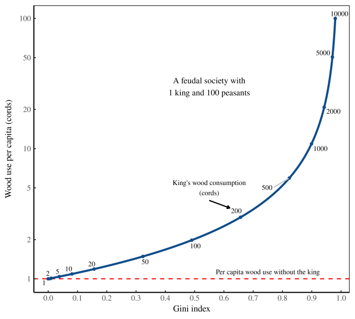 Figure 1: How inequality drives resource use. I plot here wood use per capita in a hypothetical society consisting of 1 king and 100 peasants. The peasants each consume 1 cord of wood. The blue line shows what happens to per capita consumption (vertical axis) as the king ramps up his use of wood (labeled along the curve). The horizontal axis shows the resulting wood-use inequality, as measured by the Gini index.
 Figure 2: Income inequality in the United States. I’ve plotted here the Gini index of US income inequality since 1962. Shaded regions show the tenure of US presidents. [
 Figure 3: How the US distribution of income has changed since 1970. I plot here the probability density of US income in 1970 and 2012. I have normalized incomes so that the average income of the bottom half of Americans equals 1. Note the log scales on both axes. [
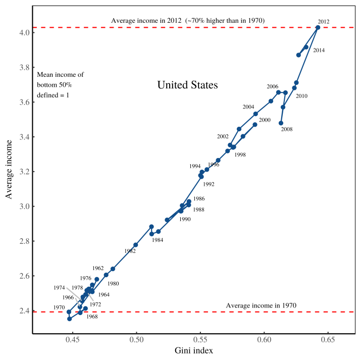 Figure 4: Growing inequality pulled up the average American income. The horizontal axis shows income inequality, measured using the Gini index. The vertical axis shows the average American income, defined so that the mean income of the bottom-half of Americans equals 1. [
 Figure 5: How inequality pulls up the average income in different countries. The horizontal axis shows income inequality (within countries), measured using the Gini index. The vertical axis shows average income (in a country), defined so that the mean income of the bottom-half of earners equals 1. [
 Figure 6: Modeling radically progressive degrowth. The horizontal axis shows income inequality (within countries), measured using the Gini index. Blue points are empirical data, reproduced from Fig.