Pity the billionaires. High in the towers on Billionaires’ Row, life is hard. The pencil-thin buildings groan as they sway in the wind, keeping penthouse dwellers up at night. Water pipes break, ruining posh décor. And elevators are unreliable, interrupting billionaires’ highly productive lives. So reads Stefanos Chen’s recent piece about the pitfalls of sky-high living.
Chen admits (thankfully) that “the plight of billionaires won’t garner much sympathy.” He is correct. As I read Chen’s piece, I shed no tears. Instead, I was fantasizing about an alternative world, one in which the super-rich would be problem free … because they wouldn’t exist.
Imagining this world without billionaires got me thinking about degrowth. In a world without billionaires, the ridiculous towers on Billionaire’s Row (below) wouldn’t exist. And that means the stupendous amounts of energy required to build these towers could have been spent on something else … or not spent at all. In short, ridding the world of billionaires sounds like a great policy for reducing resource consumption (a.k.a. ‘degrowth’).
 Pencil-thin towers on Billionaire’s Row, Manhattan. Source: Wikipedia.
In the real world, billionaires continue to multiply. But suppose they didn’t. Imagine instead that we taxed billionaires out of existence. Then we taxed millionaires out of existence. And we kept going until we harmonized all incomes down to what the bottom half of society now lives on. How much would this rich-ridding scheme reduce our consumption of resources?
I call this thought experiment ‘radically progressive degrowth’. It’s about reducing resource consumption not by lowering everyone’s standard of living, but by taxing the rich out of existence. It’s politically unthinkable, yes. But as I will show, getting rid of the rich could lead to significant degrowth.
Degrowth immiseration?
The idea of degrowth is not popular among mainstream economists. And it’s not hard to see why. For a century, economists have been both the cheerleaders of economic growth and the soothsayers who claim to know how best to achieve it. So the idea that we should do without growth — and instead degrow the economy — is viewed as heresy. Economist John Voorheis recently summarized this opposition succinctly. The problem with degrowth, he argues, is that it “requires the immiseration of the median voter in the developed world”.
At first glance, Voorheis’ claim seems solid. Degrowth requires that rich countries reduce their per capita resource consumption. And that means lowering the material standard of living of the ‘average person’. Sounds like ‘immiseration’, right?
Not necessarily.
What’s missing here is that there are different ways to bring down an average. You can do so by reducing consumption across the board. But you can also bring down the average by reducing consumption at the top. This latter possibility doesn’t involve ‘immiseration’. A better word would be ‘liberation’.
Let them eat cake
Upon hearing that starving French peasants had no bread, Marie Antoinette supposedly remarked: “Let them eat cake”.1 The phrase reflects a disturbing fact about elites. During times of crisis, it rarely occurs to elites that they are the main cause of strife.2
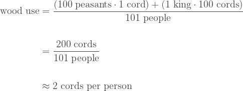
To drive this point home, let’s imagine a hypothetical feudal society that has a problem with over-consumption. The society consists of a king and 100 peasants. Every winter, the peasants harvest wood to heat their modest homes. Each peasant gets 1 cord of wood. (A cord is a stack of wood about 8 feet wide, 4 feet deep, and 4 feet high.)3 To heat his enormous castle, the king gets 100 cords of wood.
If you do the math, you find that this society consumes about 2 cords of wood per person:
Now, imagine that this wood comes from a nearby forest that can sustainably support a maximum of 1 cord per person (per year). Things seem fine … at first. But after many years of harvest, the peasants realize that the forest is disappearing. To stave off disaster, they need to halve their wood use. How?
“I have the answer!” says the king. “We shall tighten our belts. Everyone must cut their wood use in half!”
The king returns to his castle and celebrates his ‘fair’ decision. Meanwhile, there is ferment among the peasants. It’s a ‘let-them-eat-cake’ moment. The problem is that the king’s decree requires that each peasant survive on a half cord of wood. That, the peasants realize, is a recipe for ‘immiseration’. And so the peasants devise a plan of their own. Rather than halve their use of wood, the peasants decide to get rid of the king.
And with that, the problem is solved. The peasants get the wood they need, while per capita consumption gets halved. The math:

This parable of insurrection illustrates a basic principle of degrowth. Achieving degrowth is a recipe for ‘immiseration’ only if we hold existing patterns of distribution constant. But if we redistribute resources (by eliminating the rich), those at the bottom need not suffer. This is ‘radically progressive degrowth’.
(Some clarification. No, I am not advocating that we execute rich people. I am supposing that we eliminate their command of resource flows.)
How inequality drives resource consumption
Let’s return to our feudal king and his peasants (pre-insurrection). Each peasant consumes only 1 cord of wood. Yet because the king consumes such a stupendous amount (100 cords), the society’s per capita wood use is roughly double that of each peasant. What’s happening here is that inequality is driving up resource use.
Figure 1 illustrates this principle. Here I imagine that our feudal king starts at peasant-levels of wood consumption (1 cord). But over time, he ramps up his wood use to astronomical levels — all the while peasant consumption remains the same. As the king’s habits grow more gluttonous (labelled on the blue curve), they pull up the average level of wood use (vertical axis). The king’s gluttonous consumption also drives growing inequality (horizontal axis).
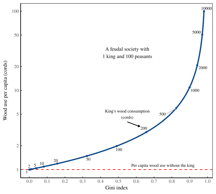 Figure 1: How inequality drives resource use. I plot here wood use per capita in a hypothetical society consisting of 1 king and 100 peasants. The peasants each consume 1 cord of wood. The blue line shows what happens to per capita consumption (vertical axis) as the king ramps up his use of wood (labeled along the curve). The horizontal axis shows the resulting wood-use inequality, as measured by the Gini index.
The point of this feudal thought experiment is to illustrate how inequality can drive up resource use. The gluttony of elites (here, the king) pulls up the average level of consumption from what it would be if the elites did not exist.
From this principle comes a corollary that is equally simple yet far more provocative. One way to lower average resource use is to get rid of elites.
The land of the free
The United States proclaims itself ‘the land of the free’ — a perennial nod to its freedom from monarchical rule. In recent years, though, the slogan has come to evoke a different type of ‘freedom’: the freedom for the rich to get richer.4
Figure 2 shows how this newfound ‘freedom’ has played out. Since 1970, income inequality — measured here using the Gini index — has exploded. In modern America, the rich have gotten richer. (And the poor … well never mind them.) Importantly, this rich-get-richer dynamic has been a bipartisan affair. Inequality rose under Republican and Democratic administrations alike.
 Figure 2: Income inequality in the United States. I’ve plotted here the Gini index of US income inequality since 1962. Shaded regions show the tenure of US presidents. [Sources and methods]
Thanks in large part to the work of Thomas Piketty, many people know about the recent rise of US inequality. What is less well-known, though, is the structure of this shift. Figure 3 shows this structure in its entirety. It’s scandalous … once you understand what’s going on.
I’ve plotted, in Figure 3, the distribution of US income in 1970 (red curve) and in 2012 (blue curve). I’ve chosen these years because they represent the minimum and maximum (respectively) of modern US inequality. You can easily spot the difference between the two curves. But to understand what this difference means takes some explaining.
 Figure 3: How the US distribution of income has changed since 1970. I plot here the probability density of US income in 1970 and 2012. I have normalized incomes so that the average income of the bottom half of Americans equals 1. Note the log scales on both axes. [Sources and methods]
Let’s first talk about the axes in Figure 3. The horizontal axis shows income. But rather than plot the dollar value of income, I’ve plotted its relative value. I have taken the bottom half of Americans and defined their average income to be 1. That’s the grey vertical line. I’ve then measured everyone’s income relative to this value. (Example: a value of 100 on the x-axis indicates an income that is 100 times the average of the bottom half of Americans.) The vertical axis in Figure 3 shows the relative number of people with the given income. The higher the value, the more people with the corresponding income.
Next let’s talk scales. Both the vertical and horizontal axes in Figure 3 use a logarithmic scale. That means tick marks correspond to factors of 10. The reason I’ve used double-log scales is that this highlights top incomes. The very rich appear in the right tail of the distribution. Their incomes are so large (hundreds of times the average) that we can only see them when we plot income on a log scale. Likewise, extremely rich individuals are so rare that we can see them only when we plot their relative numbers on a log scale.
Now that we’ve got the mechanics out of the way, let’s discuss what Figure 3 tells us about the growth of US inequality. We’ll start with what has not changed.
To see what did not change between 1970 and 2012, look at where the red and blue curves (in Figure 3) overlap. You can see that this overlap happens when incomes are close to or below 1. Now, remember that by definition, the average income of the bottom half of Americans equals 1. So the fact that the curves overlap around income = 1 doesn’t indicate that the dollar value of incomes has remained fixed. (It hasn’t.) Rather, the overlap tells us that in relative terms, the distribution of low incomes has remained stable.
The same is not true for top earners, whose incomes have exploded. To see this explosion, turn your attention to the right tails in Figure 3. (To save you from scrolling, I’ve reproduced Fig. 3 below.) The right tails tell us about the relative number of rich people in each respective year.
Figure 3: How the US distribution of income has changed since 1970. I plot here the probability density of US income in 1970 and 2012. I have normalized incomes so that the average income of the bottom half of Americans equals 1. Note the log scales on both axes. [Sources and methods]Since 1970, the American rich have gotten richer. Here’s how to read this fact from the chart. At every point in the right tail of the distributions, the 2012 curve (blue) is above the 1970 curve (red). This tells us that today, there are far more extremely rich Americans than there were 5 decades ago. In 1970, few people had incomes that exceeded 100 times the bottom-half average. Today there are plenty such people. In fact, we can now find Americans whose income exceeds 1000 times the bottom-half average.
This is the scandal implicit in Figure 3. Yes, it takes some technical chops to understand what’s going on. But now that you do, I hope this rich-get-richer story is seared in your memory.
The rich drive up the average income
Let’s return to Figure 3, but turn our attention now to the dashed vertical lines. The grey line is the average income of the bottom half of Americans — equal to 1 by definition. The red vertical line shows the average income of all Americans in 1970. Note that this average is higher than 1. That’s because the top half of Americans earn more than the bottom half, so they pull up the average. The blue vertical line shows the average income of all Americans in 2012. It seems that since 1970, the average income has grown.
I’m anticipating some misunderstanding here, so let me preemptively clarify. No, the increase in average income is not due to economic growth. It is also not due to inflation. The jump in average American income (between 1970 and 2012) is due to growing inequality. The average American income has been pulled up by the rich getting richer.
More clarification. The growth of average income (in Figure 3) is not some absolute feature of the world. It is a counterfactual thought experiment. It’s what happens when we imagine a world in which the average income of the bottom half of Americans didn’t change.
Given this assumption, I find that from 1970 to 2012, the average of all incomes rose by 70% … purely because the rich got richer. Figure 4 shows my estimate. On the horizontal axis I plot US income inequality, measured using the Gini index. On the vertical axis I plot the average US income— defined so that the bottom half of Americans have a mean income of 1.
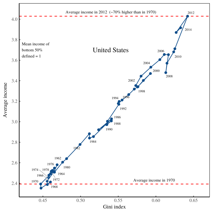 Figure 4: Growing inequality pulled up the average American income. The horizontal axis shows income inequality, measured using the Gini index. The vertical axis shows the average American income, defined so that the mean income of the bottom-half of Americans equals 1. [Sources and methods]
To interpret Figure 4, it may help to return to our hypothetical feudal society, consisting of a king and his peasants. Recall that as we dialed up the resource use of the king, inequality rose, as did per capita consumption. (See Figure 1.) Something similar happens in the US, as shown in Figure 4. Except in the US, it’s not a single person who’s grown richer — it’s a whole class of people. Still, the principle remains the same. Inequality pulls up the average income.
This rich-get-richer effect, you’ll note, is not small. Given my assumptions, I estimate that between 1970 and 2012, the average American income grew by about 70% … purely due to increasing inequality.
Radically progressive degrowth
We’re now ready to return to the idea of ‘radically progressive degrowth’. Recall that this is a reduction in resource use achieved by lowering inequality. The idea sounds far-fetched … until we do the math.
Let’s set the stage. Imagine a future version of the United States in which income inequality has been eliminated. It’s an America without billionaires or millionaires. In this future, every US citizen earns exactly what the bottom half of Americans earns (on average) today. With this scenario in mind, we ask ourselves — how much would per capita resource use drop?
To answer this question definitively, we’d have to complete the experiment. But doing so, you can probably see, would take a revolution. Fortunately, there’s an easier way to see how radically progressive degrowth might play out. We can do the experiment on paper.
In fact, I’ve already done so. In Figure 4, I found that the average income of all Americans is roughly 4 times that of the bottom half of Americans. This implies that if we downward harmonized everyone’s income to the bottom-half average, per capita income would drop by a factor of 4.
Yes, we are talking here about reducing income (not resources). But there’s good reason to suspect that an income reduction would translate into resource degrowth. The reason is simple. At the national level, per capita income correlates strongly with resource use.5 So if our four-fold drop in income translates into a similar drop in resource use, we’re talking about factor-four degrowth. That’s huge.
Now the caveats. Having considered this scenario of radically progressive degrowth, you probably realize that it’s not going to happen. No human society has ever eradicated inequality completely. So the point of this radical scenario is not to envision the degrowth that is plausible … it is to estimate the upper limits of what is possible. On that front, it is conceivable that by eradicating inequality, the US could decrease its resource use by a factor of 4.
Having made this upper estimate, let’s turn now to a scenario that is more plausible. Instead of ‘radically progressive degrowth’, let’s look at merely ‘progressive degrowth’. I’ll define ‘progressive degrowth’ as the degrowth that can be achieved by returning inequality to levels seen a few decades ago.
Imagine a counterfactual world in which Bernie Sanders won the 2016 election. He institutes an ambitious plan to reduce inequality back to 1970 levels. And he guarantees that the average income of the bottom half of Americans will not change. Billionaires protest. But there is an upswell of popular support, and the Sanders plan proceeds. Now here is the question: how much degrowth would this plan achieve?
We can get a rough estimate by returning to Figure 4. Between 1970 and 2012, the average American income grew by 70%, purely due to rising inequality. The upshot is that if we role back this inequality (in the way I have outlined), per capita income would fall by the same amount. If that translates to a similar drop in resource use, we are talking about achieving significant degrowth … just by returning inequality to 1970 levels.
The big picture
The United States is not the only country where inequality pulls up the average income. The phenomenon is ubiquitous. To illustrate this fact, Figure 5 shows the trend across all countries in the World Inequality Database. On the horizontal axis, I plot income inequality (measured by the Gini index). On the vertical axis, I plot average income (defined so that the mean income of the bottom half of earners in a country equals 1).
 Figure 5: How inequality pulls up the average income in different countries. The horizontal axis shows income inequality (within countries), measured using the Gini index. The vertical axis shows average income (in a country), defined so that the mean income of the bottom-half of earners equals 1. [Sources and methods]
Let’s start at the bottom end of inequality. As I have defined it here, a society with no inequality would have an average income of 1. Since there is always some inequality, real-world societies never reach this point. But a few come close. In 1984, communist Hungary had a Gini index of 0.13. In that year, the average income of all Hungarians was 1.2 — a mere 20% above what it would be with no inequality. Other communist countries (of that era) are in the same vicinity.
In these countries where inequality is low, the average income isn’t much above what it would be with no inequality. The consequence is that reducing inequality will produce little degrowth. The upshot, however, is that the low-inequality observations (in Figure 5) are mostly ghosts of the past. In communist Hungary, inequality was exceedingly low. But in the capitalist Hungary of today, there is far greater inequality. The same holds true for most former communist states. With the collapse of communism came the rise of inequality. That means there is now more room for achieving degrowth by reducing inequality.
Let’s turn now to the upper range of inequality (i.e. where the Gini index is greater than 0.7). Here we see that by eliminating inequality, staggering degrowth is possible. In Kuwait, for instance, if all incomes were harmonized to what the bottom-half of Kuwaitis currently earn (on average), per capita income would drop by a factor of 10. Other Arab countries (Saudi Arabia, Qatar, Oman, United Arab Emirates) could achieve similar reductions. If this income decrease translated into an in-kind drop in resource use, it would amount to astonishing degrowth.
It’s interesting that it is oil-rich Arab states that could achieve monumental degrowth by mitigating inequality. These states, you’ll note, are the real-world equivalent of my feudal kingdom. They are ruled by despotic monarchs with astounding wealth.6 Get rid of these despots, the evidence suggests, and you could achieve significant degrowth … just like in my feudal parable.
Moving on, note that just because a country could reduce its average income by mitigating inequality, it does not follow that it should. The principle of degrowth is that rich countries should degrow their consumption. Poor countries, on the other hand, deserve to increase their resource use.
On that front, Figure 5 shows that there are many impoverished nations that have significant inequality, and could therefore reduce their resource consumption by mitigating inequality. But doing so goes against the philosophy of degrowth. In these poor countries, the appropriate course of action is to turn our reasoning on its head. We hold average income constant, and then ask — if we eliminate inequality, how much could we pull up up the income of the bottom half of society?
The answer is shocking. In countries like Sierra Leone, Lesotho and Botswana, it’s something like ten-fold. Let me say that again. By eliminating inequality, it’s conceivable that we could increase the income of the bottom half of these societies by a factor of 10 … all without changing per capita resource use.
A model of radically progressive degrowth
The empirical data in Figure 5 speaks for itself. If you live in a rich country with rampant inequality, know that there is likely significant degrowth to be had by eliminating this inequality (assuming you downward harmonize top incomes).
As a scientist, however, I like to go a step beyond the empirical data and build a model. (We scientists love a good equation that predicts reality.) On that front, have a look at Figure 6. I’ve reproduced here the empirical data from Figure 5 — the trend between inequality and average income. But I now show that a simple model can predict the international trend.
 Figure 6: Modeling radically progressive degrowth. The horizontal axis shows income inequality (within countries), measured using the Gini index. Blue points are empirical data, reproduced from Fig. 5. The vertical axis shows average income (in a country), defined so that the mean income of the bottom-half of earners equals 1. The dashed red lines show the trend produced by ramping up inequality in a lognormal distribution (left) and power-law distribution (right). [Sources and methods]
The model consists of two theoretical distributions — a lognormal distribution and a power law distribution. To create the model, I adjust the parameters in these theoretical distributions, thereby ramping inequality up or down. What results are the two dashed red lines in Figure 6. The left line is produced by ramping up/down inequality in a lognormal distribution, the right line by ramping up/down inequality in a power-law distribution. You can see that the vast majority of the real-world data sits between these two curves.
What does this model tell us? It suggests that while the causes of income inequality are maddeningly complex, the results are shockingly simple. When inequality increases, the average income predictably grows.
A vanishing act
I can hear many of you saying: “The data is interesting. But what I really want to know is — how do we achieve radically progressive degrowth?”
The scientific answer is that we don’t really know, since no society has ever tried it. Still, we can speculate. On that front, the mathematics of my thought experiment are clear about what needs to happen to bring down average income. These mathematics are also shocking.
My thought experiment involves progressive income redistribution, but in a way that is different than we usually picture. We usually think of progressive redistribution as a Robin-Hood affair. We ‘take from the rich and give to the poor’. In my thought experiment, there is a Robin-Hood element. Some of the income of the rich goes to the poor. However, most of the rich’s income must simply disappear.
The most visceral way to frame this redistribution is to think of the Joker’s antics in the The Dark Knight. He steals millions from Gotham banks … and then burns the money. Fortunately, this incendiary policy (pun intended) is not the only way to make income disappear. Today, only a tiny fraction of money circulates as paper cash. The vast majority of money circulates as electronic digits, which makes destroying it less shocking. Gasoline is not required.
The reality is that governments create and destroy money every day to little fanfare. That’s because when a currency-sovereign government spends, it creates money. When the government taxes, it destroys money. It’s that simple. The net creation/destruction of money therefore depends on the government’s finances. When the government runs a deficit, money is created. When the government runs a surplus, money is destroyed.
With this dynamic in mind, here’s a fiscal policy for radically progressive degrowth. First, the government must adopt a radical tax scheme. I’m talking negative taxes for the poor, and something like a 99% tax on the incomes of the very rich. The effect of this policy will be a massive cash flow into government coffers. The next step is for government to not spend this money. As a result, the incomes of the rich will be downward harmonized (to some desired baseline). If all goes as planned, resource use should decrease.
Having laid out this fiscal policy, I’ll admit that no government (to my knowledge) has ever tried it. And it’s not hard to see why. When you take money out of a capitalist economy, you create a crisis. The result is degrowth … but we don’t call it that. We call it a recession, or a depression.
So here is the reality. Radically reducing inequality could lead to significant degrowth. But in a capitalist economy, it would be a disaster. It’s up to us to create a social system in which radically progressive degrowth is not a crisis.
 Figure 1: As countries use more energy, firms get larger. The main panel shows how average firm size (within countries) changes with energy use per capita. Color indicates a country’s energy quartile. I have labelled countries using alpha-3 codes. The inset plot shows the firm size distribution within each respective energy quartile. [
 Figure 2: As countries use more energy, the relative number of managers increases. Each line represents the path through time of a country. The black line is the smoothed trend across all countries. I have labelled select countries with their alpha-3 codes. [
 Figure 3: A model of the growth of managers. Black points are empirical observations for energy use and the relative number of managers (the same data as in Figure
  Figure 4: Inside hierarchies, relative income grows with hierarchical power. I plot here the relation between relative income (within a hierarchy) and hierarchical power (the number of subordinates + 1). In case-study firms and the US military, I measure income relative to the lowest hierarchical rank. For CEOs, I measure income relative to the firm average. [