Evidence of Decoupling Still Zero. Jessie Henshaw, Reading Nature's Signals. June 18, 2018.
The Growing Effort to Decouple GDP from Energy use and CO2, is having no apparent effect, raising serious questions about the nature of our plan.
The graph below (Figure 1) shows the 46-year record of world GDP PPP, Energy, and CO2, during which their growth rates have been in constant proportion to each other, called their “coupling.” The things to read are 1) the lack of accumulative departure from the steady trends, and 2) how closely the exponential trend lines (dotted) follow the data.
It shows that the long trend still holds despite both big efforts and bigger promises that accelerating growth using more efficient processes would separate the expanding economy from its impacts. Focusing so much on the “positive” completely disguised the big picture, though, that in 46 years there has been no accumulative effect at all. So there’s a lot to explain, yes, but the graphs below show persistent regular behaviors of the economy as a whole resilient system, a problem not yet faced at all.
 Figure 1. Coupled Growth Trends of World GDP, Energy & CO2, showing how the three move together at proportional growth rates, as parts of a whole system.
That energy use and CO2 emissions are now still growing at the same rate as 40 years ago is strong evidence that none of the sustainability measures such as exceptional efficiency gains said to decouple the economy from its impacts, have had any effect at all.
The irregularly fluctuating curves below (Figure 2) show the annual rates of coupling of world Energy and CO2 growth rates to World GDP (PPP). The scale at the left shows their locally averaged growth rates as a fraction of the locally averaged GDP growth rates (to somewhat smooth the curves) going below zero once. The important thing is to notice is that the fluctuations vary around nearly horizontal trendlines.
It’s as if the economy is guided by an “invisible hand” keeping the fluctuations symmetric to the near constant trend. It says the fluctuations have been adding up to no effect. The likely cause of this is how a competitive economy naturally works. Technology and resources are supposed to be treated as being fungible assets, to be constantly reallocated to maximize profits. In the data, that functional coupling between the physical and financial systems of the economy is shown working rather smoothly, replacing less with more profitable assets to maximize the growth of profits for the whole. That stable coupling of managed assets to growth is then an apparent natural emergent property of the system as a whole, as a partnership between human cultures and the financial world’s effort to maximize growing profits.
 Figure 2. Regular fluctuations of Energy and CO2 coupling with GDP, have repeatedly been claimed to be evidence of rapid decoupling… ignoring how very regularly the periods of apparent decline were followed promptly by reversals, as if irregular waves of water seeking the average level.
How the world community came to say that “sustainable development” would reverse this stable natural relationship between the economy and its resource uses is described in more detail in April 2014 in The Decoupling Puzzle. Small fluctuations do keep causing excitement for both devoted climate deniers and sustainability advocates, though, each picking out brief trends seeming to affirm their hopes, like the five periods of apparent rapid decline in CO2 to GDP coupling shown here. The real evidence is that the local fluctuations never seem to result in a change in the direction of the whole, like ripples on a pond that always level out. The latest dip in the CO2 coupling trend has been claimed as a sign of turning the corner by the IEA, clearly unaware of the consistent pattern of that metric repeatedly fluctuating around a near-zero trend.
Added perspective on the global data is gained by plotting the ratio of GDP to Economic Energy energy, the amount of wealth produced with a unit of energy. We call that variable “Economic Energy Efficiency,” the amount of economic wealth generated per unit of energy. Having its growth rate = 1/3 the GDP rate implying that improving efficiency contributes 1/3 of the value of energy to the world economy, growing Energy use contributing 2/3 if the value. That ratio demonstrates a general case of Jevons famous observation that in a growth economy efficiency results in growing rather than declining resource use and impacts. Any way one reasons it, what is crystal clear is that in the last 46 years strenuous effort to use efficiency for sustainability have had the opposite of the intended effect, recreating the original problem rather than solving it.
 Figure 3 The share of GDP growth contributed by Economic Energy Efficiency proves Jevons principle that in a growth economy efficiency multiplies energy use and all its accumulative earth impacts.
So we need to be suspicious of the world policy to maximize growth at any cost. The costs are rapidly swelling not shrinking. The other coupled impacts of growth also causing how people live being forced to change ever faster creating major disruptions and dissension all over the world is one of the biggest, though even the NGOs are very slow in recognizing. In nature, growth is how all kinds of natural systems begin, but those we admire for their perfection turn to refining their designs before they climax rather than, driving their growth to the point of being torn apart of being exhausted.
That’s the trick. Maximizing growth might seem logical as a way for societies to keep up with social distress and debts, but now it’s accelerating them. So now we need to balance the attraction of short-term profits and connect them all the unbalanced disruptive changes that now surround us. We talk lightly about replacing people with robots, for example, overlooking that the robots only work for the banks. That’ll make people and governments ever more indebted and incapable of responding to climate change, for one problem. And that chain of consequences goes on and on, that is as long as we keep ignoring how natural growth systems that avoid the problem work. More disruption is not the solution, only moderation.
There’s an alternative business model that could serve as a general design for growth without disruption, one that switches to paying the profits forward once any debts have been paid back. Once understood, that is what would achieve truly integrated, thriving and self-limiting development, as biomimicry of ecosystem designs. It is discussed in more detail in the article linked from my next post, Culture, Finance-for-Development, and tPPPs.
Use biomimicry for how nature uses growth to build thriving and enduring systems.
It would be a way for businesses large or small to begin to experiment with how nature succeeds in creating beautiful, thriving, and purposeful systems. It’s a fairly simple formula. It’s also a practice we all know well for how to successfully relate to other people and how to successfully complete business or home projects. It starts with building up innovations to then select what to refine for making the result resilient and purposeful in its environment. If we approached every new relation or project by piling on new experiments with no turn toward refining something to last in the end, all the effort would go to waste in the end.
To start you study the similarity between nature’s way of building things to perfection and how we do our own home or office projects! They all take place in “three acts.” The first act is for “innovating,“ the second for “refining,“ and the third act the “release” of the finished product into its waiting environment (IRR). You see the same three acts in the birth cycle, and in the start-up of new businesses too, as well as the formation of new cultures and most every other kind of individual development. The trick is really to pay attention to the inspiration that starts it off, as something to fulfill. That lets you anticipate and move smoothly between the stages of emerging development, first adding up more innovations, then refining the ones worth keeping to the end. It’s what comes most naturally when we can see the whole effect.
The Growing Rate of Climate Change. Apr. 8, 2019.
Showing:
Yes, it is a somewhat radical approach, but is fully data-driven, meticulous, and at the high side of the IPCC uncertainties, making it plausible. So it should challenge others to try to confirm or dispute the findings. Losing 10 years in preparing for 1.5 degrees C also makes this finding, if true, extremely urgent to respond to.
The Path of Atmospheric CO2 – To understand climate change it helps to start with the whole picture, the great sweep of increasing concentration of CO2 in the atmosphere shown in Figure 1, as the main cause of the greenhouse effect. Looking at where it began, you can clearly see the fairly abrupt shift in the trends at about 1780, also about the same time as rapid industrial growth was beginning, seeming to mark the abrupt emergence of fossil fuel industry that the rest of the curve clearly represents.
Look closely at the relatively lazy shapes of pre-1780 variation in CO2 back to 1500 (purple) and how that pattern differs from the abrupt start of the growing rates of increase (green line) after 1780 an how closely it follows the mathematical average growth rate curve (dotted). Note how the trendline threads through the fluctuations in the data starting from 1780. The way the data moves back and forth *centered on the constant growth curve* is what implies that the organization of the economy for using fossil fuels had an constant growth rate, of 1.48 %/yr. Hopefully that seems rather remarkable to you, but the data is clear, that the global economy has a single organization for behaving as a whole, as a natural system, with a stable state of self-organization in that period.
 Figure 1 – The abrupt emergence of climate change with the industrial economy, evident in the constant compound growth of atmospheric CO2 PPM at 1.48 %/yr, from 1780 to WWII, followed by a pause and then the transition to the even higher growth rate 1.90 %/yr, That second growth spurt, continuing to the present, presumably reflect the modern reorganization of the world economy for maximum growth informally called “globalization.”
 Figure 2 – The “relative heating” of the the earth to Atmospheric CO2 concentration, indicating temperature change has an approximately linear relation to CO2 (brown line) for the range of concentrations (300 to 400 PPM) over recent times. The triangles indicate concentrations in 1985. (Mitchell 1989, Figure 6 w/ added color)
The Growing Effort to Decouple GDP from Energy use and CO2, is having no apparent effect, raising serious questions about the nature of our plan.
The graph below (Figure 1) shows the 46-year record of world GDP PPP, Energy, and CO2, during which their growth rates have been in constant proportion to each other, called their “coupling.” The things to read are 1) the lack of accumulative departure from the steady trends, and 2) how closely the exponential trend lines (dotted) follow the data.
It shows that the long trend still holds despite both big efforts and bigger promises that accelerating growth using more efficient processes would separate the expanding economy from its impacts. Focusing so much on the “positive” completely disguised the big picture, though, that in 46 years there has been no accumulative effect at all. So there’s a lot to explain, yes, but the graphs below show persistent regular behaviors of the economy as a whole resilient system, a problem not yet faced at all.
 Figure 1. Coupled Growth Trends of World GDP, Energy & CO2, showing how the three move together at proportional growth rates, as parts of a whole system.
That energy use and CO2 emissions are now still growing at the same rate as 40 years ago is strong evidence that none of the sustainability measures such as exceptional efficiency gains said to decouple the economy from its impacts, have had any effect at all.
The irregularly fluctuating curves below (Figure 2) show the annual rates of coupling of world Energy and CO2 growth rates to World GDP (PPP). The scale at the left shows their locally averaged growth rates as a fraction of the locally averaged GDP growth rates (to somewhat smooth the curves) going below zero once. The important thing is to notice is that the fluctuations vary around nearly horizontal trendlines.
It’s as if the economy is guided by an “invisible hand” keeping the fluctuations symmetric to the near constant trend. It says the fluctuations have been adding up to no effect. The likely cause of this is how a competitive economy naturally works. Technology and resources are supposed to be treated as being fungible assets, to be constantly reallocated to maximize profits. In the data, that functional coupling between the physical and financial systems of the economy is shown working rather smoothly, replacing less with more profitable assets to maximize the growth of profits for the whole. That stable coupling of managed assets to growth is then an apparent natural emergent property of the system as a whole, as a partnership between human cultures and the financial world’s effort to maximize growing profits.
 Figure 2. Regular fluctuations of Energy and CO2 coupling with GDP, have repeatedly been claimed to be evidence of rapid decoupling… ignoring how very regularly the periods of apparent decline were followed promptly by reversals, as if irregular waves of water seeking the average level.
 How the world community came to say that “sustainable development” would reverse this stable natural relationship between the economy and its resource uses is described in more detail in April 2014 in The Decoupling Puzzle. Small fluctuations do keep causing excitement for both devoted climate deniers and sustainability advocates, though, each picking out brief trends seeming to affirm their hopes, like the five periods of apparent rapid decline in CO2 to GDP coupling shown here. The real evidence is that the local fluctuations never seem to result in a change in the direction of the whole, like ripples on a pond that always level out. The latest dip in the CO2 coupling trend has been claimed as a sign of turning the corner by the IEA, clearly unaware of the consistent pattern of that metric repeatedly fluctuating around a near-zero trend.
Added perspective on the global data is gained by plotting the ratio of GDP to Economic Energy energy, the amount of wealth produced with a unit of energy. We call that variable “Economic Energy Efficiency,” the amount of economic wealth generated per unit of energy. Having its growth rate = 1/3 the GDP rate implying that improving efficiency contributes 1/3 of the value of energy to the world economy, growing Energy use contributing 2/3 if the value. That ratio demonstrates a general case of Jevons famous observation that in a growth economy efficiency results in growing rather than declining resource use and impacts. Any way one reasons it, what is crystal clear is that in the last 46 years strenuous effort to use efficiency for sustainability have had the opposite of the intended effect, recreating the original problem rather than solving it.
 Figure 3 The share of GDP growth contributed by Economic Energy Efficiency proves Jevons principle that in a growth economy efficiency multiplies energy use and all its accumulative earth impacts.
So we need to be suspicious of the world policy to maximize growth at any cost. The costs are rapidly swelling not shrinking. The other coupled impacts of growth also causing how people live being forced to change ever faster creating major disruptions and dissension all over the world is one of the biggest, though even the NGOs are very slow in recognizing. In nature, growth is how all kinds of natural systems begin, but those we admire for their perfection turn to refining their designs before they climax rather than, driving their growth to the point of being torn apart of being exhausted.
That’s the trick. Maximizing growth might seem logical as a way for societies to keep up with social distress and debts, but now it’s accelerating them. So now we need to balance the attraction of short-term profits and connect them all the unbalanced disruptive changes that now surround us. We talk lightly about replacing people with robots, for example, overlooking that the robots only work for the banks. That’ll make people and governments ever more indebted and incapable of responding to climate change, for one problem. And that chain of consequences goes on and on, that is as long as we keep ignoring how natural growth systems that avoid the problem work. More disruption is not the solution, only moderation.
There’s an alternative business model that could serve as a general design for growth without disruption, one that switches to paying the profits forward once any debts have been paid back. Once understood, that is what would achieve truly integrated, thriving and self-limiting development, as biomimicry of ecosystem designs. It is discussed in more detail in the article linked from my next post, Culture, Finance-for-Development, and tPPPs.
Use biomimicry for how nature uses growth to build thriving and enduring systems.
It would be a way for businesses large or small to begin to experiment with how nature succeeds in creating beautiful, thriving, and purposeful systems. It’s a fairly simple formula. It’s also a practice we all know well for how to successfully relate to other people and how to successfully complete business or home projects. It starts with building up innovations to then select what to refine for making the result resilient and purposeful in its environment. If we approached every new relation or project by piling on new experiments with no turn toward refining something to last in the end, all the effort would go to waste in the end.
To start you study the similarity between nature’s way of building things to perfection and how we do our own home or office projects! They all take place in “three acts.” The first act is for “innovating,“ the second for “refining,“ and the third act the “release” of the finished product into its waiting environment (IRR). You see the same three acts in the birth cycle, and in the start-up of new businesses too, as well as the formation of new cultures and most every other kind of individual development. The trick is really to pay attention to the inspiration that starts it off, as something to fulfill. That lets you anticipate and move smoothly between the stages of emerging development, first adding up more innovations, then refining the ones worth keeping to the end. It’s what comes most naturally when we can see the whole effect.
The Growing Rate of Climate Change. Apr. 8, 2019.
Showing:
- A presently elevated growth rate of CO2 in the atmosphere directly linked to globalization.
- And resulting likely 1.5 degree C warming by 2030, TEN years earlier than the recent IPCC estimate.
- Plus a fascinating story of diagnostic data science discovery.
Yes, it is a somewhat radical approach, but is fully data-driven, meticulous, and at the high side of the IPCC uncertainties, making it plausible. So it should challenge others to try to confirm or dispute the findings. Losing 10 years in preparing for 1.5 degrees C also makes this finding, if true, extremely urgent to respond to.
The Path of Atmospheric CO2 – To understand climate change it helps to start with the whole picture, the great sweep of increasing concentration of CO2 in the atmosphere shown in Figure 1, as the main cause of the greenhouse effect. Looking at where it began, you can clearly see the fairly abrupt shift in the trends at about 1780, also about the same time as rapid industrial growth was beginning, seeming to mark the abrupt emergence of fossil fuel industry that the rest of the curve clearly represents.
Look closely at the relatively lazy shapes of pre-1780 variation in CO2 back to 1500 (purple) and how that pattern differs from the abrupt start of the growing rates of increase (green line) after 1780 an how closely it follows the mathematical average growth rate curve (dotted). Note how the trendline threads through the fluctuations in the data starting from 1780. The way the data moves back and forth *centered on the constant growth curve* is what implies that the organization of the economy for using fossil fuels had an constant growth rate, of 1.48 %/yr. Hopefully that seems rather remarkable to you, but the data is clear, that the global economy has a single organization for behaving as a whole, as a natural system, with a stable state of self-organization in that period.
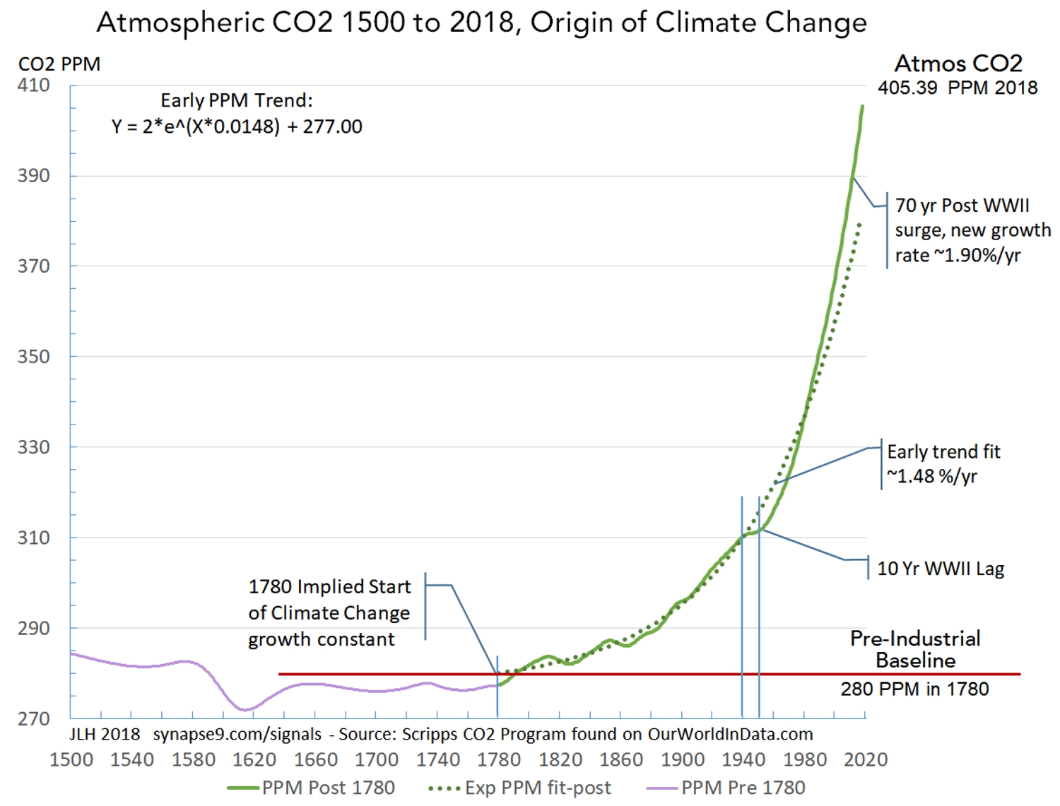 Figure 1 – The abrupt emergence of climate change with the industrial economy, evident in the constant compound growth of atmospheric CO2 PPM at 1.48 %/yr, from 1780 to WWII, followed by a pause and then the transition to the even higher growth rate 1.90 %/yr, That second growth spurt, continuing to the present, presumably reflect the modern reorganization of the world economy for maximum growth informally called “globalization.”
We know from the absorption of heat radiation by CO2, creating the greenhouse effect, that the CO2 greenhouse effect is heating the earth in relation to its concentration in the atmosphere. What implies that relation is close to linear, making the effect directly proportional to the cause, is shown in the Figure 2. The dashed brown line shows the slope of the relation, closely fitting the actual gradual curve, at least between 300 to 400 PPM, the thresholds that were crossed in 1914 and 2016 respectively, a period of 102 years. Atmospheric CO2 is increasing much faster now, though, so the next increase of 100 PPM, to 500 PPM, will be reached much more quickly rising at its current stable rate of 1.9 %/yr rate. If that rate continues 500 PPM will be reached in only 30 more years, by 2046. That large acceleration is the effect of the current higher exponential rate of increase. Of course, considering the rapid compound acceleration of the cause of climate change, and the alarm people are taking now, quite a lot could happen before 2046.
Figure 2 – The “relative heating” of the the earth to Atmospheric CO2 concentration, indicating temperature change has an approximately linear relation to CO2 (brown line) for the range of concentrations (300 to 400 PPM) over recent times. The triangles indicate concentrations in 1985. (Mitchell 1989, Figure 6 w/ added color)
The Annual PPM Growth Rates – Figure 3 shows the growth of Atmospheric CO2 (green) with the details of its fluctuating annual growth rates, to depict both the constants of the growth curve and it’s irregular growth rate interruptions. The individual interruptions raise lots of interesting questions, but perhaps the most important feature is that they are quite temporary, as evidence of the constant behavior recovering again and again.
The upper curve shows fluctuating annual growth rates (lt. axis, PPM dy/Y) for the curve below, the CO2 PPM concentrations. The peaks and drops of the growth rate align with the small waves in the concentration (rt. axis). Note that the large drops in the growth rate that seem to snap right back to the the horizontal dashed red lines. That seems to show that they mark processes that absorb and then release CO2 again, as they do not seem to affect the average growth rates of PPM concentrations as a whole, around which the annual fluctuations homeostatically fluctuate.
This diagnostic approach is for raising questions like the above, using the annual growth rate to expose the dynamics of the curve for a somewhat anatomical picture. In this case it’s of the homing dynamics of the global growth system as it first hovers around the rate 1.48 %/yr from 1780 up to WWII, and then shifts to hovering around the higher rate of 1.9 %/yr as it stabilizes from 1971 to 2018. You might think of these two long periods of homeostatic growth rates in CO2 concentration as representing periods of regularity in the causal systems, global economic growth and the carbon cycle response, seen through the lens of atmospheric CO2.
You might think the large departures from the regular trends would be great recessions perhaps, that then “make up for lost time” on recovery. I could not find corresponding recessions, though, and for the great recessions I checked there do not seem to be notable dips in CO2 accumulation. To validate this kind of research one has to go through that kind of thought process for every bump on the curve, either a tedious or exciting hunt for plausible causes than then check out with other data.
What seems most unusual about the big dips in the CO2 growth rate (D1, 2, 3, 4, 5) is that 1) they do not occur after WWII and 2) they rise and fall so sharply and have no lasting effect, seemingly temperature sensitive as well as absorbing CO2 later released. I can’t say whether it is feasible or not, but something like vast ocean plankton blooms might have that effect, absorbing and then releasing large amounts of CO2. There’s also a chance the way the raw data was splined and the growth rates smoothed, to turn irregularly spaced measures into smooth curves, might also have unexpected effects. Whatever phenomenon causing the big dips was, it appears to have been interrupted by the rapid acceleration of warming that followed WWII, as evident in the smooth and uninterrupted rise in most recent and best raw data. Those are at least pieces of the puzzle that might help someone else narrow it down.
 Figure 3. Atmospheric CO2 concentration (CO2 PPM)(rt. scale) and its annual growth rates (PPM %/yr)(lt. scale), showing the change in growth constants before and after WWII. The key evidence of these being different organizational states of the world economy (before & after WWII) is regular “homeostatic” (home seeking) reversal of trends departing from the growth constants. It is the post WWII growth constant state of 1.90 %/yr that is preventing normal policy process from intervening in climate change, and needs to be “recentered” on learning from nature rather than overwhelming nature for our survival.
Comparing the CO2 cause and degree C effect – The main purpose of Figure 4 is to compare the history of earth temperatures (blue, ‘C, lt scale) with the curve of atmospheric CO2 (green, PPM, rt scale). The CO2 PPM data is the same Scripps atmospheric CO2 data and scale we’ve seen below. The temperature data is from the HadCRUT4 records used by the IPCC. In this case the original anomaly data relative to the 1850-1900 average have been converted to absolute ‘C values, using a conditional set point of 14.6 ‘C in 2017. In a way it is as arbitrary a coordinating value as the others people use. It’s chosen here first for being a more familiar scale, but also so that 1780 initial values for PPM and ‘C can be determined as initial values for the greenhouse effect. Those baselines are essential for defining the exponential growth rates of the PPM and ‘C curves. The 14.6 ‘C value was based on an expert’s estimate.
 Figure 4
Aligning the curves for Figure 4 lets us look closely to see if any shapes of the cause of the greenhouse effect (PPM) are clearly visible in the shape of the effect, global warming (‘C). Does anything in particular jump out? First might be the differences, one curve quite smooth the other jittery, both having wavy fluctuation patterns too, but of very different scales and periods. The first thing you might ask about is how regularly irregular the ‘C curve is seems to be. That variation is thought to be mostly due to annually shifting ocean currents, along with weather system changes and the difficulty of measuring the temperature of a complex varying world.
The ‘C curve (Figure 4) also shows the two ‘Great waves’ (#1 and #2) in earth temperature that appear to be independent of the greenhouse effect. The dotted red line was visually interpolated as the midline of the irregular but seemingly quite constant fluctuating annual temperatures of the HadCRUT4 data. The blue dotted line was added to suggest earlier large waves in earth temperature copied from the shapes in the ancient temperature reconstructions seen in Figure 5. I physically overlaid those reconstructions of ancient temperatures on Figure 4, drawing a continuation of the Figure 4 midline curve that fit the Figure 5 curves.
One might say the minima of the great waves in the ‘C curve display a trend somewhat like the general trend of the PPM curve, say from 1780 to 1980. The one shape that makes the two curves seem really connected, though, is the way the sharply rising PPM curve (the implied cause) and ‘C curve (the implied response) both start following a “hockey stick shape” in the 1980s. It even seems the shape of the ‘C curve interrupts the great waves as it takes off exponentially, breaking a rhythm that seems to go back many centuries. There is a possibility that the great waves represent upper atmosphere standing convection patterns waxing and waning, something that increasing convection intensity could interrupt. Perhaps that would help others find what the great wave cycle, or not. Since theory suggests the trends of both cause and effect have a linear component Figure 6 shows a linear scaling of the PPM curve to see if it and the ‘C curve can fit.
 Figure 5 – NOAA (2007) 1300 to 2007 Northern Hemisphere record of temperature reconstructions. Measured from a 1881-1980 baseline. This it taken from a longer history keeping the units and adding a title and dates 1780 and 1880 (brown). That is the period after the greenhouse effect began before it was visible in the records of earth temperature. The red line shows an old NOAA speculation that warming developed earlier and slower than found here.
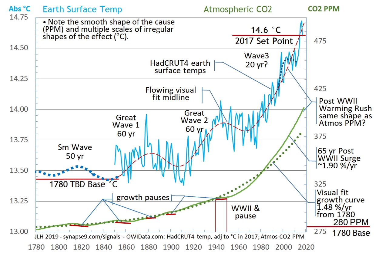 Figure 4
Aligning the curves for Figure 4 lets us look closely to see if any shapes of the cause of the greenhouse effect (PPM) are clearly visible in the shape of the effect, global warming (‘C). Does anything in particular jump out? First might be the differences, one curve quite smooth the other jittery, both having wavy fluctuation patterns too, but of very different scales and periods. The first thing you might ask about is how regularly irregular the ‘C curve is seems to be. That variation is thought to be mostly due to annually shifting ocean currents, along with weather system changes and the difficulty of measuring the temperature of a complex varying world.
The ‘C curve (Figure 4) also shows the two ‘Great waves’ (#1 and #2) in earth temperature that appear to be independent of the greenhouse effect. The dotted red line was visually interpolated as the midline of the irregular but seemingly quite constant fluctuating annual temperatures of the HadCRUT4 data. The blue dotted line was added to suggest earlier large waves in earth temperature copied from the shapes in the ancient temperature reconstructions seen in Figure 5. I physically overlaid those reconstructions of ancient temperatures on Figure 4, drawing a continuation of the Figure 4 midline curve that fit the Figure 5 curves.
One might say the minima of the great waves in the ‘C curve display a trend somewhat like the general trend of the PPM curve, say from 1780 to 1980. The one shape that makes the two curves seem really connected, though, is the way the sharply rising PPM curve (the implied cause) and ‘C curve (the implied response) both start following a “hockey stick shape” in the 1980s. It even seems the shape of the ‘C curve interrupts the great waves as it takes off exponentially, breaking a rhythm that seems to go back many centuries. There is a possibility that the great waves represent upper atmosphere standing convection patterns waxing and waning, something that increasing convection intensity could interrupt. Perhaps that would help others find what the great wave cycle, or not. Since theory suggests the trends of both cause and effect have a linear component Figure 6 shows a linear scaling of the PPM curve to see if it and the ‘C curve can fit.
Figure 5 – NOAA (2007) 1300 to 2007 Northern Hemisphere record of temperature reconstructions. Measured from a 1881-1980 baseline. This it taken from a longer history keeping the units and adding a title and dates 1780 and 1880 (brown). That is the period after the greenhouse effect began before it was visible in the records of earth temperature. The red line shows an old NOAA speculation that warming developed earlier and slower than found here.
Scaling CO2 PPM to Make a ‘C Proxy – The reason to scale PPM to emulate the dynamics of ‘C curve is simple. The ‘C fluctuation is so erratic the variety of curves to predict its future is rather extreme, so people have been generally using a straight line. An exponential curve is not a straight line, though. So the quite regular shapes of the PPM curve, including its clearly measurable growth constants, 1.48 % before and 1.9% currently, do make it a prime candidate as a useful proxy. Even if the trend has a clear direction now we of course have to allow for increasing uncertainty over time. Adding to that are the plans for dramatically cutting CO2 despite a world economy dramatically increasing its production, a tug of war that could be interrupted by actual war or other economic downturn.
Where the current stable growth rate of climate change seems headed, knowing the PPM curve should be linearly proportional to the greenhouse effect, we experimentally scale CO2 PPM see if it fits the ‘C curve in a logical way (Figure 6).
Scaling the PPM curve to fit the ‘C curve makes a PPM’C proxy curve, hoping to fit the midline of the highly irregular ‘C curve from 1980 to the present. Both the units and the baseline are not determined, though, to produce the proxy curve in PPM’C = A*PPM + B, using a linear scale factor A and a baseline B. A third determinant is then finding a optimal fit between the very different earlier shapes of the curves. So basically I tried lots of things, and found my initial assumptions were mostly wrong. Initially I made the mistake of trying to fit the PPM’C curve to the midline of the earlier ‘Great waves’, and tried several ways until it was clear they were all wrong.
Then I realized those earlier great waves were really not related to the greenhouse effect. So my greenhouse effect projection might better be interpreted as coming up under the earlier systems, like it actually looks. That was purely a graphic device at first. Then when I adjusted the PPM’C curve to pass under the ‘Great Waves’ I set it to go through the midline of local fluctuations instead of the Great Wave departures. Suddenly the fit of rapid growth period became as perfect as I could ask for. I spent some time trying to figure out why, studying all the loose ends, in the end resolving that’s what the data seemed to say. That PPM’C curve then becomes the hypothesized most likely “real” rate of greenhouse effect climate change, and offering a much more narrowly regulated way for projecting its future.
Figure 5 shows both the best fit scaling of the PPM’C proxy curve (dark green dashed line), and its extension to 2050 at its presently stable growth rate of 1.90 %/yr (dashed light green line). Yes there are various uncertainties, but the threat of climate change so far has seemed to be from underestimating, not overestimating, and the findings do appear to be well within the IPCC uncertainties given the difficulty of projecting the temperature data directly.
I think it means that reaching 1.5 ‘C by 2030 is a much more probable estimate of the current trend than reaching 1.5 ‘C by 2040.
 Figure 6 – The PPM’C curve scaled to closely fit the HadCRUT4 data and then projected at the homeostatically stabilized growth rate of observed in atmospheric CO2. How long this projection might hold depends on how robust the global natural and economic systems driving the growth rate in atmospheric CO2.
__________________________________________________
The Economy as a Whole – How great a new threat this acceleration in atmospheric CO2 pollution and its greenhouse effect are seems to rest on just how stubborn the global homeostatic regulating systems observed are. That could really change the climate mitigation picture, and help explain why there has been only negative progress in slowing CO2 pollution. So far it seems to have been neglected, with negotiation over mitigating climate change not seeming to take into account the organizational inertia and persistence of the global economic system as a whole.
Figure 7 shows a group of major indicators of the global economy that were selected for having constant growth rates from 1971 (the earliest data for some) to 2016. The GDP PPP curve in trillions of 2016 dollars is growing the fastest, and each of the other curves was indexed to GDP in 1971 in proportion to their relative growth rates. For example, since total economic energy use is growing at about 2/3 the rate of world GDP that variable was scaled to 2/3 of GDP at 1971. This device displays the steady relation between them called “coupling.” That the same proportionality of the growth curves is constant throughout it indicates each of these curves reflects the behavior of the same system. What seems to cement the view that the global economic system appears to be behaving as a whole is the visual evidence that the data of each of these series, like the CO2 PPM data we discussed at length before, seems to fluctuate homeostatically about the growth constant.
What physically coordinates the economy’s coordinated relationships between different sectors displayed here as growth constants seems likely to be cultural constants of each cultural institution, or “silo” of the world economic culture. Every community seems to develop its own expected way for things to work and change and seems to become the way the different sectors end up coordinating their ways of working with each other. That all of this is organized primarily around the use of the exceptionally versatile resource of fossil fuels then indicates that a deeper reorganization of the economy than a swapping of one set of technology for another will be involved. It should suggest to any reader just how very much of the world economy would need to be reorganized, and to be reminded that the last times the world economy was sufficiently disrupted to be reorganized were during WWII and the 1930s.
This topic is also the subject of a longer research paper. Science review drafts are likely to be available later in April 2019.
Figure 7. The global economy working remarkably smoothly as a whole system of coordinated parts, seemingly much like theory says it should, but most people don’t see because they don’t look at the behavior of the system as a whole.
 Figure 8 – Smoothed annual growth rates of recent world energy use and CO2 emissions, showing close coupling of their fluctuations with relatively insignificant trend.
 Figure 9 – Log Plot of Figure 7 variables with a 1780 to 2020 time scale. The backcasting of their exponential constants displays the convergence with the backcast GDP trend of four of them at ~1935 and with two others (blue circles) at ~1920. The effect implies the stable coordination of the parts of the global economic growth system established by the 1970’s was in the 1920s and 30s.
__________________________________
A draft paper Coupling of Growth Constants and Climate Change has full details on the data sources, methods and references:
Data Sources:
Atmospheric CO2 PPM 1501-2015: OurWorldInData.org
https://ourworldindata.org/co2-and-other-greenhouse-gas-emissions
as well as from the Scripps source directly:
(Scripps, 1958 to present)(Macfarling Meur 2006)
http://scrippsco2.ucsd.edu/data/atmospheric_co2/icecore_merged_products
“Record based on ice core data before 1958, and yearly averages of direct observations from Mauna Loa and the South Pole after and including 1958.”
HadCRUT4 earth temperatures 1850-2017 – Rosner: https://ourworldindata.org/co2-and-other-greenhouse-gas-emissions
The world bank was my source for GDP PPP and for from 1990 to 2016
– https://data.worldbank.org/indicator/NY.GDP.MKTP.PP.CD?end=2016&start=1990
World Food Production – 1961-2016 FAO:
http://www.fao.org/faostat/en/#data/QI
World Meat Production – 1961-2016 Rosner – OurWorldInData: https://ourworldindata.org/meat-and-seafood-production-consumption
Modern CO2 Emissions – 1971-2016, Archived IEA CO2 data extended with WRI CO2 emissions: https://www.wri.org/resources/data-sets/cait-historical-emissions-data-countries-us-states-unfccc
– Because the latest economic CO2 emissions data is 2014 not 2016 as for other data, the trend of atmospheric CO2 was used to project the economic emissions data for the last two missing data points, showing no anomalous direction. https://www.co2.earth/annual-co2
BP offered energy data in MtOe in its “Statistical Review of World Energy – all data 1965-2017”
– https://www.bp.com/en/global/corporate/energy-economics/statistical-review-of-world-energy/downloads.html
The IEA news item statement that CO2 flattened for 2016 and 2017 was used, just to show how little effect it would have if true
– https://www.iea.org/newsroom/energysnapshots/global-carbon-dioxide-emissions-1980-2016.html
Where the current stable growth rate of climate change seems headed, knowing the PPM curve should be linearly proportional to the greenhouse effect, we experimentally scale CO2 PPM see if it fits the ‘C curve in a logical way (Figure 6).
Scaling the PPM curve to fit the ‘C curve makes a PPM’C proxy curve, hoping to fit the midline of the highly irregular ‘C curve from 1980 to the present. Both the units and the baseline are not determined, though, to produce the proxy curve in PPM’C = A*PPM + B, using a linear scale factor A and a baseline B. A third determinant is then finding a optimal fit between the very different earlier shapes of the curves. So basically I tried lots of things, and found my initial assumptions were mostly wrong. Initially I made the mistake of trying to fit the PPM’C curve to the midline of the earlier ‘Great waves’, and tried several ways until it was clear they were all wrong.
Then I realized those earlier great waves were really not related to the greenhouse effect. So my greenhouse effect projection might better be interpreted as coming up under the earlier systems, like it actually looks. That was purely a graphic device at first. Then when I adjusted the PPM’C curve to pass under the ‘Great Waves’ I set it to go through the midline of local fluctuations instead of the Great Wave departures. Suddenly the fit of rapid growth period became as perfect as I could ask for. I spent some time trying to figure out why, studying all the loose ends, in the end resolving that’s what the data seemed to say. That PPM’C curve then becomes the hypothesized most likely “real” rate of greenhouse effect climate change, and offering a much more narrowly regulated way for projecting its future.
Figure 5 shows both the best fit scaling of the PPM’C proxy curve (dark green dashed line), and its extension to 2050 at its presently stable growth rate of 1.90 %/yr (dashed light green line). Yes there are various uncertainties, but the threat of climate change so far has seemed to be from underestimating, not overestimating, and the findings do appear to be well within the IPCC uncertainties given the difficulty of projecting the temperature data directly.
I think it means that reaching 1.5 ‘C by 2030 is a much more probable estimate of the current trend than reaching 1.5 ‘C by 2040.
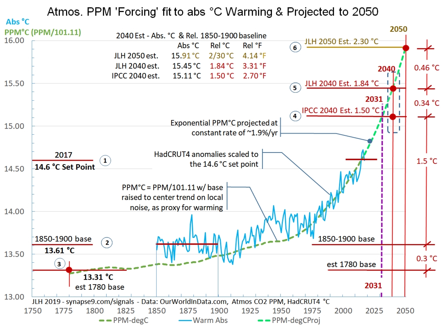 Figure 6 – The PPM’C curve scaled to closely fit the HadCRUT4 data and then projected at the homeostatically stabilized growth rate of observed in atmospheric CO2. How long this projection might hold depends on how robust the global natural and economic systems driving the growth rate in atmospheric CO2.
__________________________________________________
The Economy as a Whole – How great a new threat this acceleration in atmospheric CO2 pollution and its greenhouse effect are seems to rest on just how stubborn the global homeostatic regulating systems observed are. That could really change the climate mitigation picture, and help explain why there has been only negative progress in slowing CO2 pollution. So far it seems to have been neglected, with negotiation over mitigating climate change not seeming to take into account the organizational inertia and persistence of the global economic system as a whole.
Figure 7 shows a group of major indicators of the global economy that were selected for having constant growth rates from 1971 (the earliest data for some) to 2016. The GDP PPP curve in trillions of 2016 dollars is growing the fastest, and each of the other curves was indexed to GDP in 1971 in proportion to their relative growth rates. For example, since total economic energy use is growing at about 2/3 the rate of world GDP that variable was scaled to 2/3 of GDP at 1971. This device displays the steady relation between them called “coupling.” That the same proportionality of the growth curves is constant throughout it indicates each of these curves reflects the behavior of the same system. What seems to cement the view that the global economic system appears to be behaving as a whole is the visual evidence that the data of each of these series, like the CO2 PPM data we discussed at length before, seems to fluctuate homeostatically about the growth constant.
What physically coordinates the economy’s coordinated relationships between different sectors displayed here as growth constants seems likely to be cultural constants of each cultural institution, or “silo” of the world economic culture. Every community seems to develop its own expected way for things to work and change and seems to become the way the different sectors end up coordinating their ways of working with each other. That all of this is organized primarily around the use of the exceptionally versatile resource of fossil fuels then indicates that a deeper reorganization of the economy than a swapping of one set of technology for another will be involved. It should suggest to any reader just how very much of the world economy would need to be reorganized, and to be reminded that the last times the world economy was sufficiently disrupted to be reorganized were during WWII and the 1930s.
This topic is also the subject of a longer research paper. Science review drafts are likely to be available later in April 2019.
 Figure 7. The global economy working remarkably smoothly as a whole system of coordinated parts, seemingly much like theory says it should, but most people don’t see because they don’t look at the behavior of the system as a whole.Figure 8 – Smoothed annual growth rates of recent world energy use and CO2 emissions, showing close coupling of their fluctuations with relatively insignificant trend.Figure 9 – Log Plot of Figure 7 variables with a 1780 to 2020 time scale. The backcasting of their exponential constants displays the convergence with the backcast GDP trend of four of them at ~1935 and with two others (blue circles) at ~1920. The effect implies the stable coordination of the parts of the global economic growth system established by the 1970’s was in the 1920s and 30s.
__________________________________
A draft paper Coupling of Growth Constants and Climate Change has full details on the data sources, methods and references:
Data Sources:
Atmospheric CO2 PPM 1501-2015: OurWorldInData.org
https://ourworldindata.org/co2-and-other-greenhouse-gas-emissions
as well as from the Scripps source directly:
(Scripps, 1958 to present)(Macfarling Meur 2006)
http://scrippsco2.ucsd.edu/data/atmospheric_co2/icecore_merged_products
“Record based on ice core data before 1958, and yearly averages of direct observations from Mauna Loa and the South Pole after and including 1958.”
HadCRUT4 earth temperatures 1850-2017 – Rosner: https://ourworldindata.org/co2-and-other-greenhouse-gas-emissions
The world bank was my source for GDP PPP and for from 1990 to 2016
– https://data.worldbank.org/indicator/NY.GDP.MKTP.PP.CD?end=2016&start=1990
World Food Production – 1961-2016 FAO:
http://www.fao.org/faostat/en/#data/QI
World Meat Production – 1961-2016 Rosner – OurWorldInData: https://ourworldindata.org/meat-and-seafood-production-consumption
Modern CO2 Emissions – 1971-2016, Archived IEA CO2 data extended with WRI CO2 emissions: https://www.wri.org/resources/data-sets/cait-historical-emissions-data-countries-us-states-unfccc
– Because the latest economic CO2 emissions data is 2014 not 2016 as for other data, the trend of atmospheric CO2 was used to project the economic emissions data for the last two missing data points, showing no anomalous direction. https://www.co2.earth/annual-co2
BP offered energy data in MtOe in its “Statistical Review of World Energy – all data 1965-2017”
– https://www.bp.com/en/global/corporate/energy-economics/statistical-review-of-world-energy/downloads.html
The IEA news item statement that CO2 flattened for 2016 and 2017 was used, just to show how little effect it would have if true
– https://www.iea.org/newsroom/energysnapshots/global-carbon-dioxide-emissions-1980-2016.html
No comments:
Post a Comment