Quite early on in Material World I wrote that :
pursuing our various environmental goals will, in the short and medium term, require considerably more materials to build the electric cars, wind turbines and solar panels needed to replace fossil fuels. The upshot is that in the coming decades we are likely to extract more metals from the earth’s surface than ever before.The point being that while in the long run it’s quite possible that we reduce the size of humanity’s footprint on the planet, in the immediate future we will do a lot more exploiting. We will mine more, refine more and consume more stuff - and the stuff we need for the energy transition will only add to this material intensity. The footprint will grow.
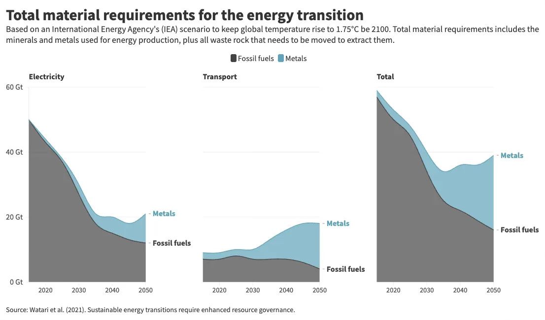
So, how does one square this with a few interesting papers which seem, on the face of it, to be suggesting precisely the opposite thing? Among the most prominent was this recent paper by Joey Nijnens and others. The paper looks at the total amount of material requirements for the energy transition and compares them with our current fossil fuel use.
The charts underline an important point. We use an extraordinary amount of fossil fuels each year (far, far more than most people appreciate). And the main message from this chart is that while we’ll certainly need to do a lot of mining to get the copper, lithium, cobalt etc we’ll need, that weight of “new” stuff will be far less than the weight of all the fossil fuels we’re no longer using.
But the chart, which begins at around 2020, seems to suggest that this is happening now.
In other words, far from increasing in the short to medium term, as I wrote in my book, it looks tantalisingly as if humanity’s material footprint is actually about to fall immediately.
Hannah Ritchie did an excellent post a few weeks ago on that paper and another one making a similar point. As you’ll see from her chart (based on the data in the other paper, this one from Takuma Watari et al), the shape of the line is quite similar:
On the basis of all these charts it looks as if our mineral demand has already peaked, and that it will fall on a more or less constant basis in the coming years. Indeed, if we improve our ability to recycle then the line goes down even faster, so that by 2050 our apparent footprint has diminished considerably.
But is this really plausible? In other words, might things have improved so rapidly since I wrote those words above that I am already wrong - that far from growing, our footprint is about to shrink?
Unfortunately, the answer is no, for two reasons.
The first, and by far the most important, is that the charts above are based not on a realistic forecast for where our mineral consumption may actually head in the coming decades, but a very ambitious pathway we are already short of.
You see, the charts above are predicated on the International Energy Agency’s Net Zero Emissions (NZE) pathway.
Long story short, a couple of years ago the IEA produced an excellent report providing a roadmap for how we might be able to get to net zero across the world. Actually they provided three roadmaps: a very ambitious pathway which could actually get the world to net zero by 2050 (the NZE pathway), as well as two other routes - one based on “announced pledges” (APS) - what governments said they would do and “stated policies” (STEPS), which is, for want of a better phrase, “business as usual”.
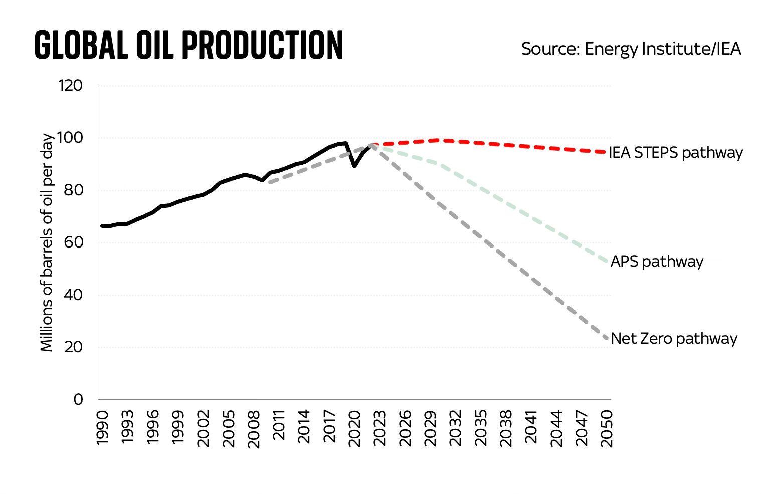
You get a sense of the difference between these pathways when you look at the chart above, in which I’ve mapped out what each of these IEA pathways assumes about crude oil production. The net zero pathway involves a very quick fall in global oil production in the coming years. But the other two pathways see oil production fall far more slowly (and, by extension, we fail to keep global temperatures below the 1.5 degree threshold).
Now let’s look at where the IEA thinks, on the basis of its latest assessment of what’s actually happening in the oil market, production is and is likely to head in the coming years. I’ve added another line to the chart:
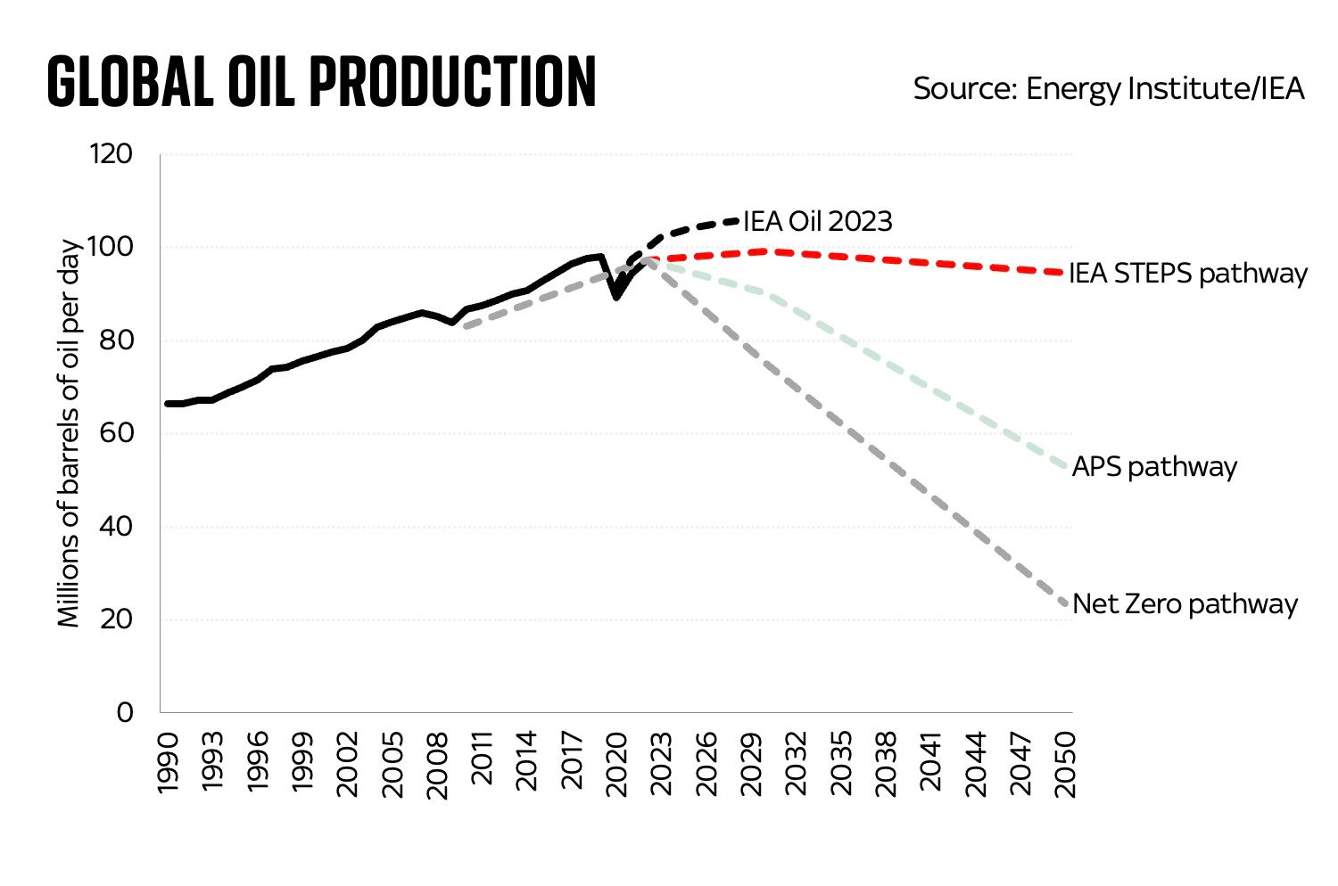
You probably already get the picture. Far from following the net zero pathway, we are already some way short of it. Actually it’s worse than that: oil consumption is likely to overshoot all of those pathways in the coming years.
This, by the way, is precisely the story told by another recent report, the UN Production Gap 2023 report, which compares some of these pathways with where it actually looks, based on what fossil fuel producers are doing, where we’re heading. Look at the difference between the red lines below and, well, pretty much all the other lines.
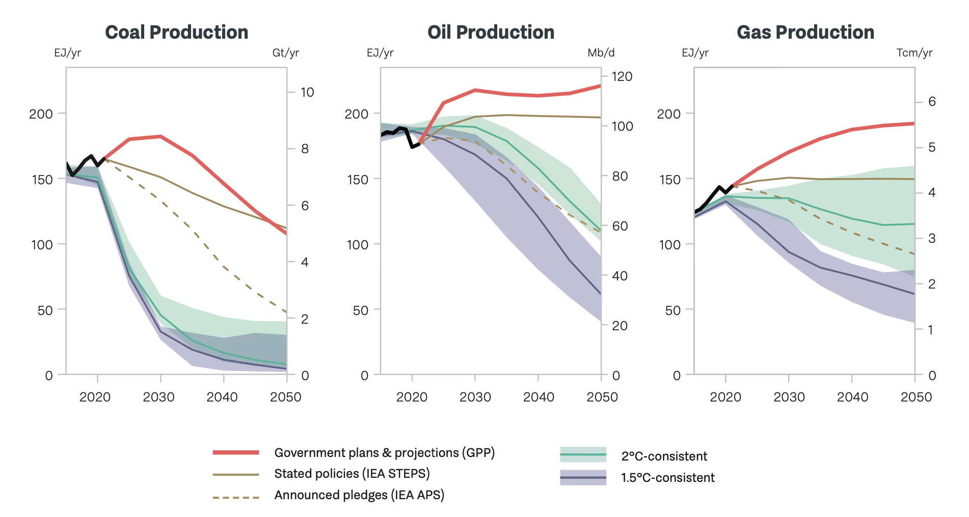
You see, on the basis of revealed preference - what fossil producers are actually doing as opposed to what the IEA and others would rather like them to do - those lines aren’t going down in the coming years. They are rising, and in the case of oil and gas they may be considerably higher in 2050 than they are today. Coal production also just hit a record high in 2023.
Now, I suspect and also rather hope that the reality turns out to be considerably lower than those red lines. But what this exercise does is to underline that far from falling in line with the IEA’s best case scenario, right now fossil fuel use is rising above even its worst case scenario.
So any papers looking at future minerals demand and basing it on the IEA’s net zero scenario must be regarded not as exercises in prediction but as interesting thought experiments. Which, in fairness to these papers, is precisely what they are. And they make an important point: that in due course the energy transition should be far less mineral-intensive than today’s fossil fuel era. But the timing implied by those charts is way off.
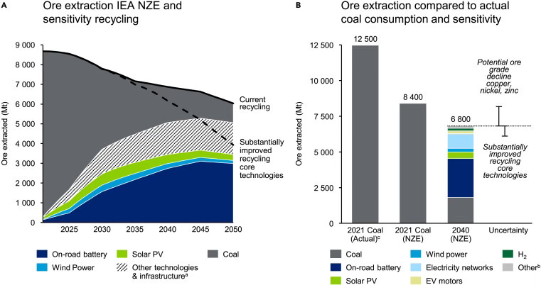
Now, it’s worth saying, in the supplementary material to their paper, Nijnens et al say that if the world followed the STEPS scenario (eg the IEA’s worst case scenario) then:
“The estimate for 2040 ROM coal and ore extraction in the STEPS scenario is 8470 Mt, a similar extraction to the 2021 NZE ROM coal and ore extraction calculated in this research.”
In other words (and bear in mind this is based on a scenario which we’re already overshooting), our footprint will increase and then plateau before it decreases. And that decrease won’t begin for a while. There will, in other words, be a hump.
Once we get over that hump, the footprint does indeed start to shrink as the dynamics mapped in these papers suggest. As I wrote in the book, squint a bit and you can envisage a future where:
The world will be a healthier, more productive place, with fewer deaths from pollution, and since we will mine far fewer fossil fuels than today, our footprint will genuinely have shrunk across the world.
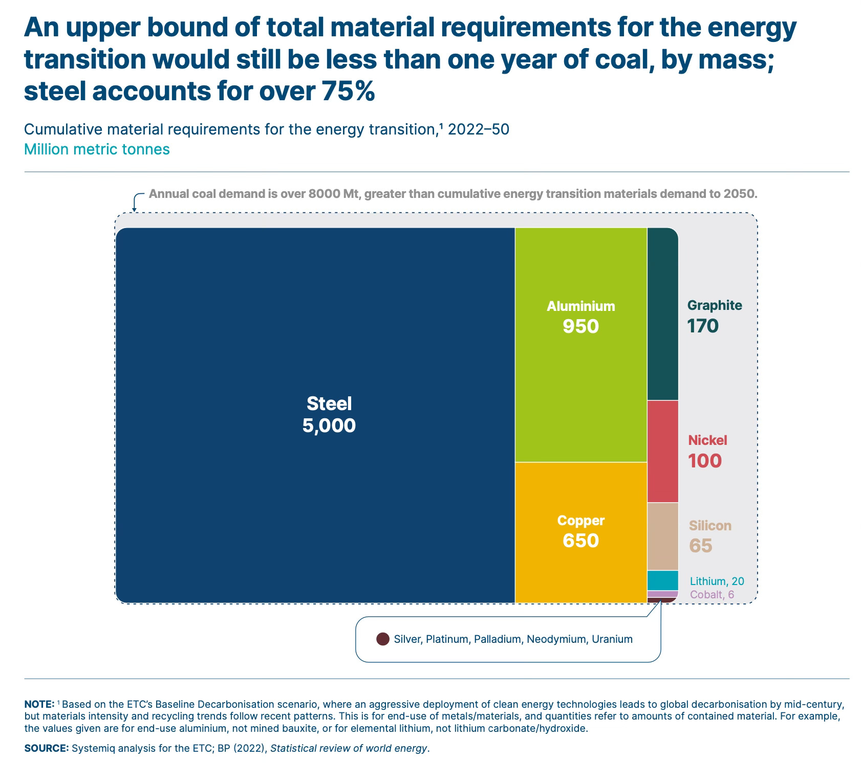
And for further excellent infographics about the sheer difference in scale between fossil fuel mining and future mining for green energy infrastructure (including stuff like steel), there’s a great recent report from the Energy Transitions Commission. With charts like this one:
But while this might be the case in the future, it’s not going to be the case for quite some time.
And that hump, like it or not, is probably what we’re heading for in the coming years. Those charts at the top are, like the IEA’s net zero model, better thought of as wishful thinking.
That brings us to a broader point, one recently made by the excellent Rob West of Thunder Said Energy: it’s very important to distinguish between the many models of what could constitute a plausible pathway to net zero and the pathway we’re actually on. None of this is to deny that these models are useful guides to how we might be able to shift towards cleaner energy: but they’re what they are. They’re models.

Rob’s own models, while we’re at it, suggest there will indeed be a peak (or maybe better to call it a plateau) for our material consumption around 2030, mostly thanks to a fall in global coal consumption. But his chart - the one above - is very different indeed to the ones at the top. For one thing, it has that hump.
Anyway, all of this is before you consider the other proviso which has to be appended to the analysis in these papers, which is that they aren’t considering all of the materials.
As you’ll know if you’ve read the book or indeed some of my previous blogs, the majority of our planetary footprint isn’t metals or fossil fuels, but the sands and aggregates and stone we dig and blast out of the earth’s surface to provide us with construction materials. It’s concrete; it’s sand used for land reclamation; it’s the aggregates we use to pave our roads.
And frankly there’s little sign of our consumption of that kind of stuff falling any time soon.
It would have been nice to have ended 2023 by declaring that we had reached the point of “peak stuff” - as those charts at the top seem to imply. But the reality is very different.
Our mineral consumption isn’t about to fall. We’re heading for the hump.
No comments:
Post a Comment